

Art and design blog examples: 9 real blogs and what makes them work

Readers of art and design blogs notice every choice on the page. Colossal opens on a giant rounded wordmark, Brand New shows old and new logos side by side, and Design Milk trims its header so the story cards get the attention.

Every blog checked live on . Notes describe only what you can see on the homepage.

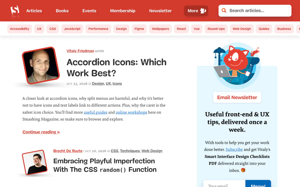
  • Smashing Magazine homepage: red header, topic pills, articles with tilted author photos and a newsletter box with a cat mascot

    Smashing Magazine

    smashingmagazine.com

    Articles, books and workshops for web designers and developers.

    What makes it work

    • A row of topic pills under the header (Accessibility, UX, CSS, JavaScript, Performance) works as a second menu.
    • Each article shows the author’s photo in a tilted red frame, with the date and topic links.
    • The newsletter box promises “useful front-end & UX tips, delivered once a week” plus a free PDF, and the button says “Meow!”.
    Visit Smashing Magazine(opens in a new tab)
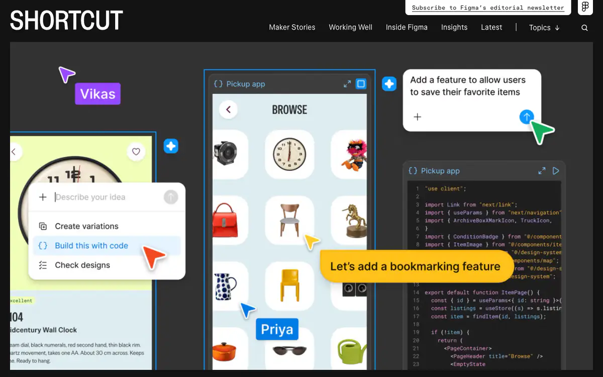
  • Figma’s Shortcut blog homepage: dark header with a SHORTCUT wordmark and a large illustration of people designing together

    Shortcut by Figma

    figma.com/blog · Custom-built · Next.js

    Figma’s editorial site about design, building products and working well.

    What makes it work

    • The blog is branded as its own publication, “Shortcut”, instead of “Figma Blog”.
    • Sections are named like a magazine’s: Maker Stories, Working Well, Inside Figma, Insights.
    • A “Subscribe to Figma’s editorial newsletter” tab is pinned to the top right corner.
    Visit Shortcut by Figma(opens in a new tab)
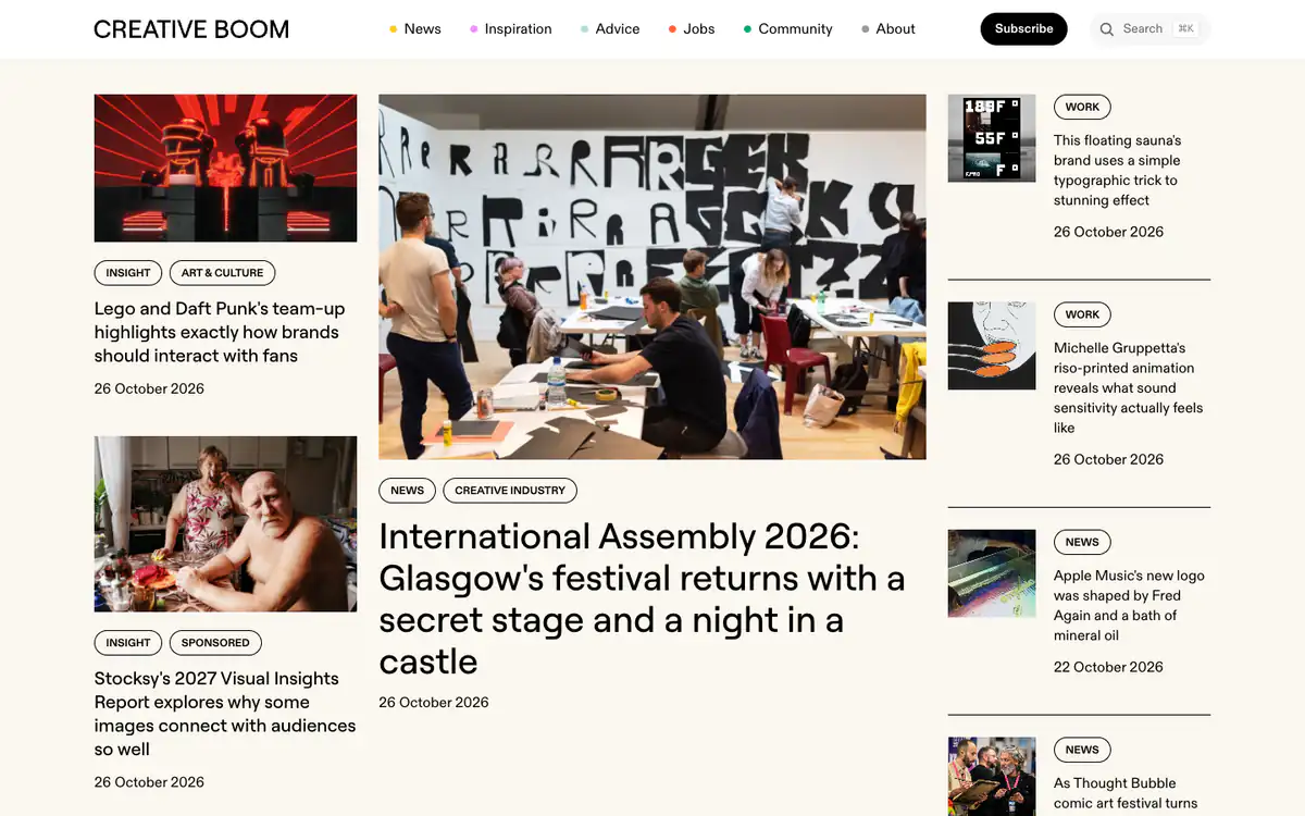
  • Creative Boom homepage: three-column layout with a large photo of an art workshop as the lead story and tagged stories around it

    Creative Boom

    creativeboom.com

    News, inspiration and advice for the creative industries.

    What makes it work

    • A colored dot before each menu item (News, Inspiration, Advice, Jobs, Community) gives every section its own color.
    • A three-column front page: a big lead story in the middle with smaller stories on either side.
    • Outlined tag pills (Insight, News, Work) sit above every headline, and sponsored posts are labeled “Sponsored”.
    Visit Creative Boom(opens in a new tab)
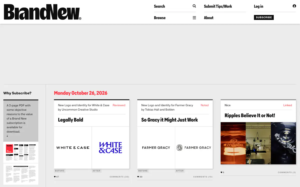
  • Brand New homepage: bold black logo, a red date heading and cards with before and after logos

    Brand New

    underconsideration.com/brandnew · WordPress

    Reviews of new logos and brand identities.

    What makes it work

    • Each card shows the old and new logo side by side, labeled “Before” and “After”.
    • Posts are tagged Reviewed, Noted or Linked, so readers know how deep each one goes.
    • A “Why Subscribe?” sidebar offers a 2-page PDF on the value of a subscription.
    Visit Brand New(opens in a new tab)
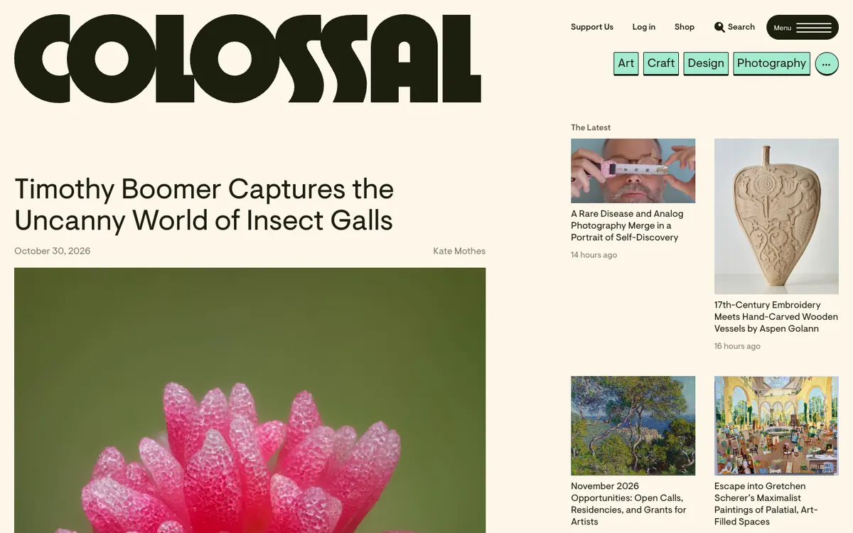
  • Colossal homepage: giant wordmark, topic buttons, a large lead story headline over a photo and a grid of small latest stories

    Colossal

    thisiscolossal.com · WordPress

    Stories on contemporary art, craft, design and photography.

    What makes it work

    • A giant rounded “Colossal” wordmark on a cream background gives the site a bold, memorable look before any article appears.
    • The lead story is a light, oversized headline (“Timothy Boomer Captures the Uncanny World of Insect Galls”) with the date and author, above a very large photo.
    • A “The Latest” grid on the right shows small image cards with times like “14 hours ago”, and light green buttons for “Art”, “Craft”, “Design” and “Photography” sit above it.
    Visit Colossal(opens in a new tab)
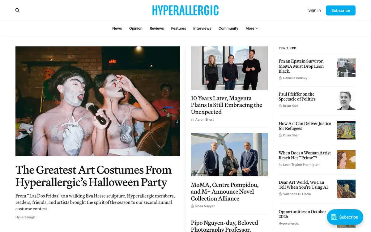
  • Hyperallergic homepage: blue logo, section menu, a large lead photo story, a middle column of stories and a Featured list

    Hyperallergic

    hyperallergic.com · Ghost

    Art news, reviews, opinion and interviews from the contemporary art world.

    What makes it work

    • Three columns give a newspaper feel: a big lead photo with headline and summary on the left, image-led stories in the middle and a “Featured” list on the right.
    • The menu uses plain words (“News”, “Opinion”, “Reviews”, “Features”, “Interviews”, “Community”), so readers know what kind of piece they will get.
    • The “Featured” list pairs each headline with a small square thumbnail and an author name, with a lock icon beside most names, so readers can scan many reads in one glance.
    Visit Hyperallergic(opens in a new tab)
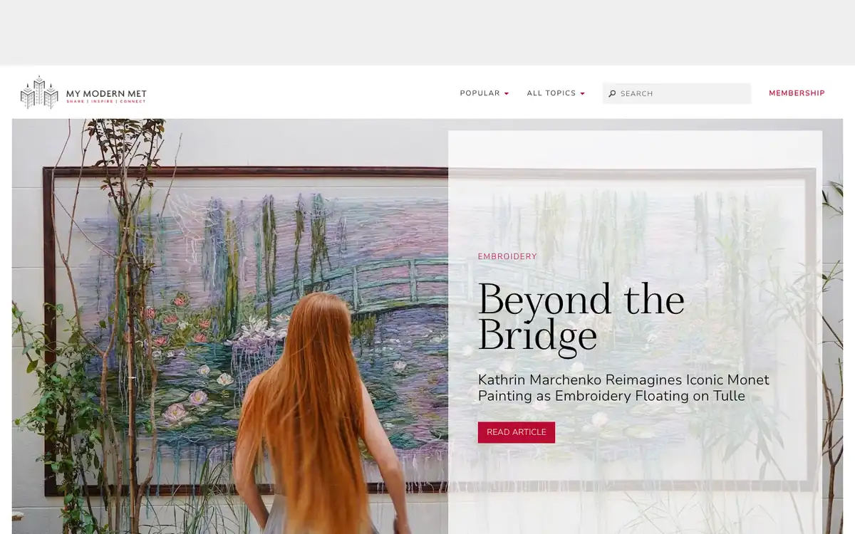
  • My Modern Met homepage: slim menu and a full-width embroidery artwork photo with a headline panel and a red Read Article button

    My Modern Met

    mymodernmet.com · WordPress

    Stories about art and creative ideas under the motto Share, Inspire, Connect.

    What makes it work

    • A full-width artwork photo fills the top of the page, with a translucent white panel holding the tag “Embroidery”, a large serif headline (“Beyond the Bridge”) and a red “Read Article” button.
    • The short headline is followed by one line that gives the detail (“Kathrin Marchenko Reimagines Iconic Monet Painting as Embroidery Floating on Tulle”), so readers get the hook and the facts together.
    • The slim menu has only “Popular”, “All Topics”, a search field and a red “Membership” link, which leaves the artwork as the main thing on screen.
    Visit My Modern Met(opens in a new tab)
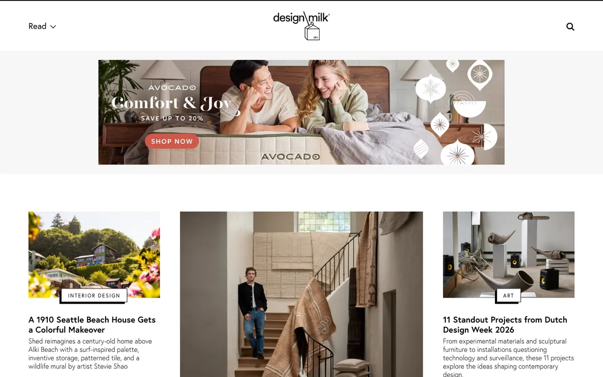
  • Design Milk homepage: minimal logo header, a wide banner ad and three photo story cards with boxed category labels

    Design Milk

    design-milk.com · WordPress

    Design news on interiors, art and home furnishings.

    What makes it work

    • The header is stripped down to the milk-carton logo, a “Read” dropdown and a search icon, so the story cards get the attention.
    • Three story cards sit side by side, and each has a boxed category label (“Interior Design”, “Art”) that overlaps the bottom edge of the photo.
    • Every card has a bold title and a three-line summary, such as “A 1910 Seattle Beach House Gets a Colorful Makeover”, so the idea is clear before the click.
    Visit Design Milk(opens in a new tab)
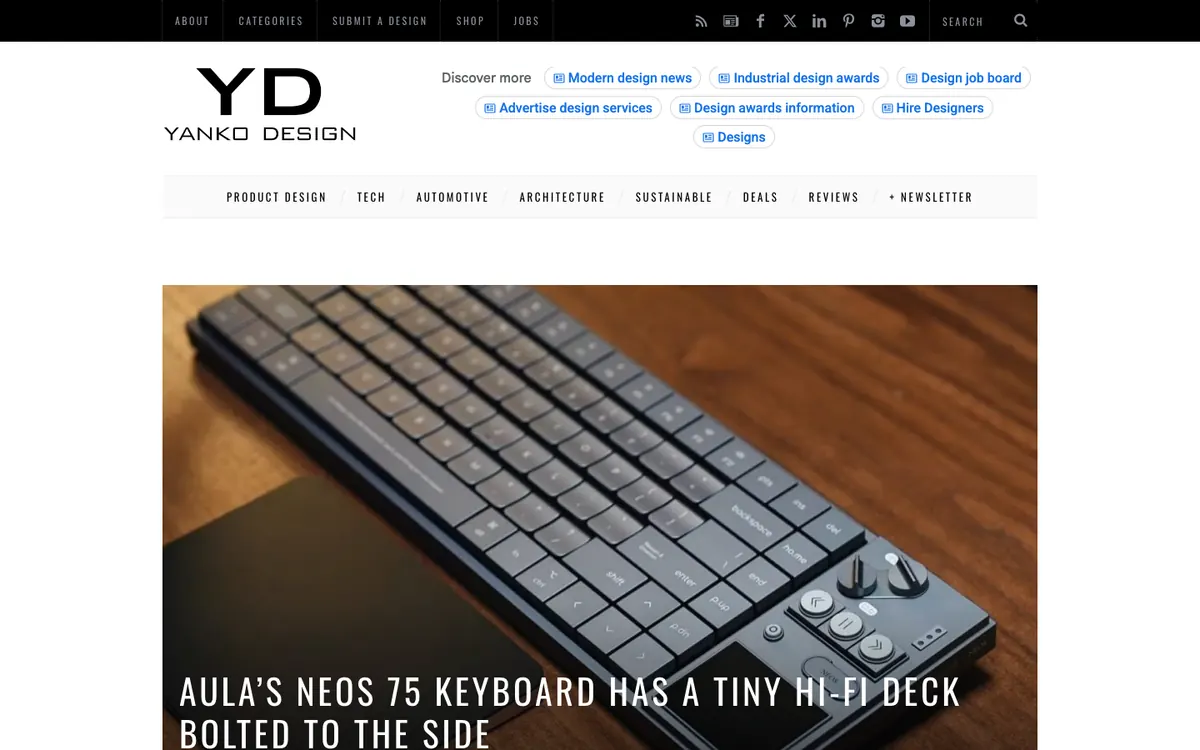
  • Yanko Design homepage: logo with Discover more links, a topic menu and a huge keyboard photo with an all-caps headline

    Yanko Design

    yankodesign.com · WordPress

    Product design news covering tech, automotive, architecture and more.

    What makes it work

    • The lead story is a huge product photo with the headline laid over it in all-caps condensed type (“Aula’s Neos 75 keyboard has a tiny hi-fi deck bolted to the side”).
    • A topic menu lists “Product Design”, “Tech”, “Automotive”, “Architecture”, “Sustainable”, “Deals”, “Reviews” and “+ Newsletter”, so each interest is one click away.
    • Next to the logo, rounded “Discover more” links such as “Industrial design awards” and “Design job board” point readers to other parts of the site.
    Visit Yanko Design(opens in a new tab)
No blog yet? Get one free with Outrank BlogsFree
A fast, SEO-ready blog on your own domain, live in one minute. Outrank publishes your articles to it automatically.
Create your blog for free

More blog examples by niche

See all blog examples
background

Your turn

Found a style you like? Start a blog like this, free.