

Newsletter blog examples: 9 real blogs and what makes them work

A newsletter blog has one job: get the email address. Platformer makes the signup its hero, Tedium jokes about its own subscribe button, and Lenny’s Newsletter gives newcomers a “Most Popular” strip to start from. Best newsletter platforms

Every blog checked live on . Notes describe only what you can see on the homepage.

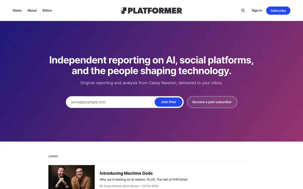
  • Platformer homepage: purple gradient hero with a one-line pitch and an email signup, and the latest posts below

    Platformer

    platformer.news · Ghost

    Casey Newton’s newsletter on AI, social platforms and the people shaping technology.

    What makes it work

    • The hero is the pitch: one sentence on what it covers and an email field with “Join free”, next to “Become a paid subscriber”.
    • The menu has three links: Home, About and Ethics.
    • The “Latest” list adds a “PLUS:” teaser line under headlines, so readers see a second story in the issue.
    Visit Platformer(opens in a new tab)
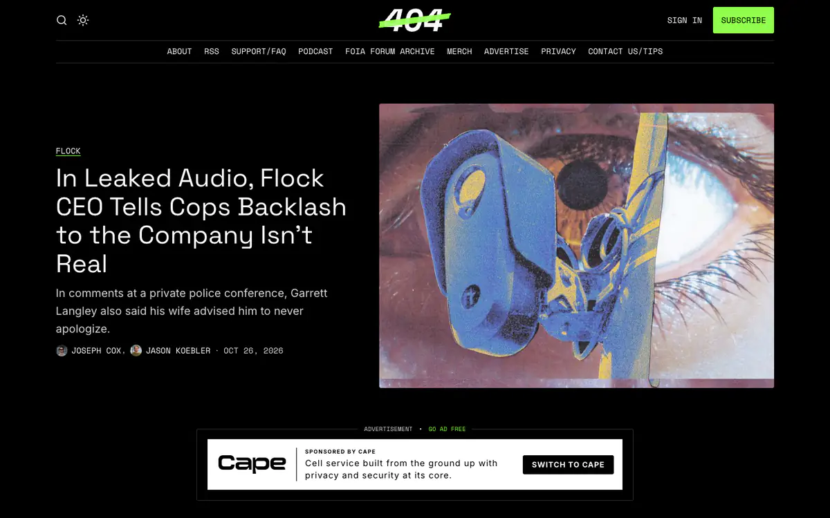
  • 404 Media homepage: black page with a neon green logo, a lead story headline and an illustration of an eye

    404 Media

    404media.co · Ghost

    Tech investigations and news, published on the site and by email.

    What makes it work

    • A dark theme with a neon green logo and Subscribe button stands out from other news sites.
    • Monospace type for the menu, tags, bylines and dates.
    • The ad slot is labeled “Advertisement · Go ad free”, which turns every ad into a reason to subscribe.
    Visit 404 Media(opens in a new tab)
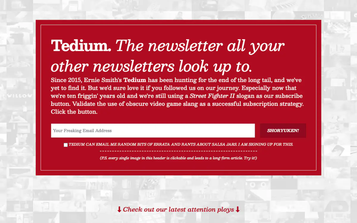
  • Tedium homepage: red box with a serif pitch for the newsletter and an email field, over a mosaic of grey images

    Tedium

    tedium.co · Craft CMS

    Ernie Smith’s newsletter, hunting for “the end of the long tail”.

    What makes it work

    • The homepage is one big pitch in a red box, written as a joke about its own subscribe button.
    • The button says “Shoryuken!” and the email field says “Your Freaking Email Address”.
    • The header background is a mosaic of images, and a note says each one links to a long-form article.
    Visit Tedium(opens in a new tab)
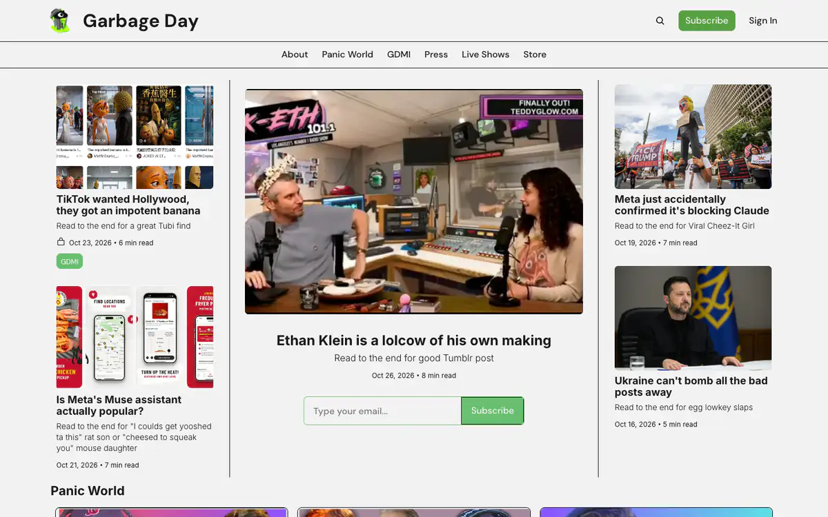
  • Garbage Day homepage: green trash can logo, three columns of stories with a large photo in the middle and an email box

    Garbage Day

    garbageday.email · beehiiv

    A newsletter about internet culture.

    What makes it work

    • Every teaser has a “Read to the end for…” line promising a bonus at the bottom of the issue.
    • A three-column front page with the email signup right under the lead story.
    • Each post shows its reading time and date, and the menu adds Live Shows and a Store.
    Visit Garbage Day(opens in a new tab)
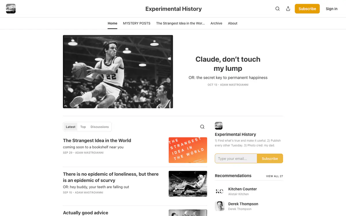
  • Experimental History homepage: black and white basketball photo as the featured post, latest posts and a yellow subscribe box

    Experimental History

    experimental-history.com · Substack

    Adam Mastroianni’s essays, published as a Substack newsletter.

    What makes it work

    • Every title has a playful “OR:” subtitle (“OR: the secret key to permanent happiness”).
    • The sidebar about line lists the blog’s rules, including “Publish every other Tuesday.”
    • An email box and a “Recommendations” list of other newsletters sit in the sidebar.
    Visit Experimental History(opens in a new tab)
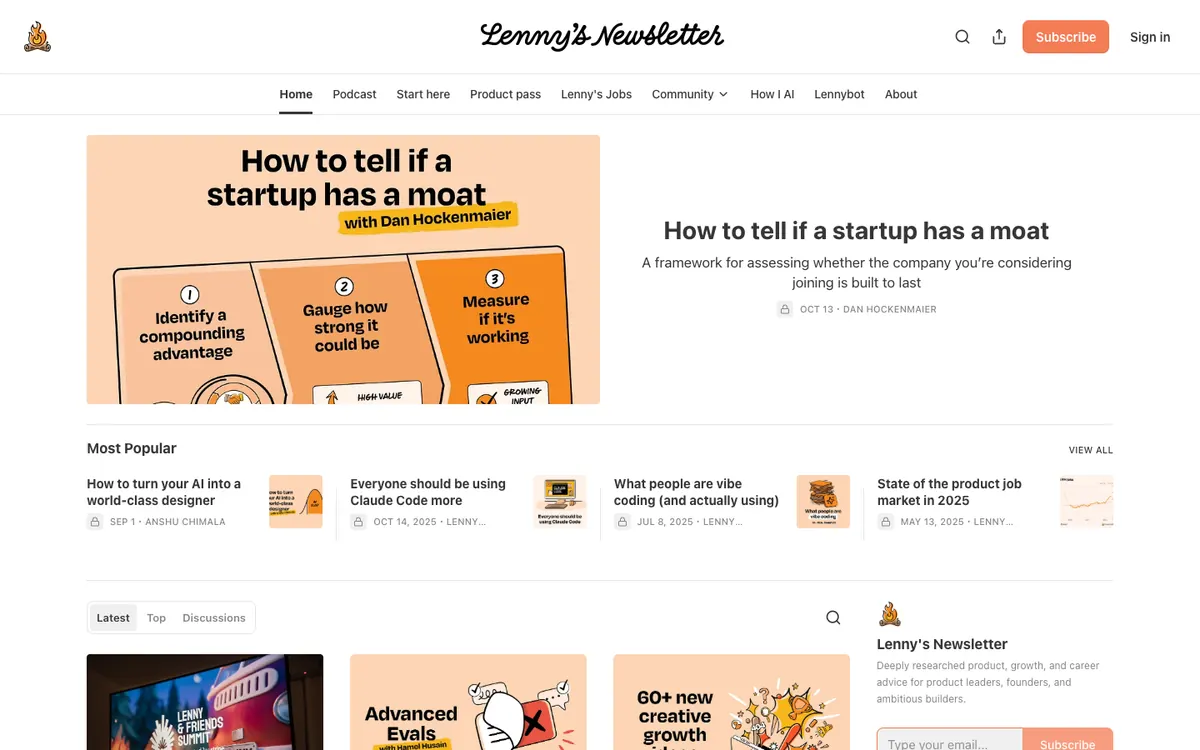
  • Lenny’s Newsletter homepage: handwritten title, tab menu, a peach illustrated lead post and a Most Popular row

    Lenny’s Newsletter

    lennysnewsletter.com · Substack

    Product, growth and career advice for product leaders, founders and builders.

    What makes it work

    • A “Most Popular” strip under the lead post lists four posts with small thumbnails, so newcomers can start with the most-read pieces.
    • The menu goes beyond posts with “Podcast”, “Start here”, “Product pass”, “Lenny’s Jobs”, “Community” and “Lennybot”, which shows readers what else is on offer.
    • Custom peach and orange illustrations carry the lead image and the cards, so the home page keeps one color theme across posts.
    Visit Lenny’s Newsletter(opens in a new tab)
  • Not Boring homepage: centered serif title, series menu, a clay-style illustrated lead post and a Most Popular row

    Not Boring

    notboring.co · Substack

    Packy McCormick’s deep dives and weekly roundups on technology companies.

    What makes it work

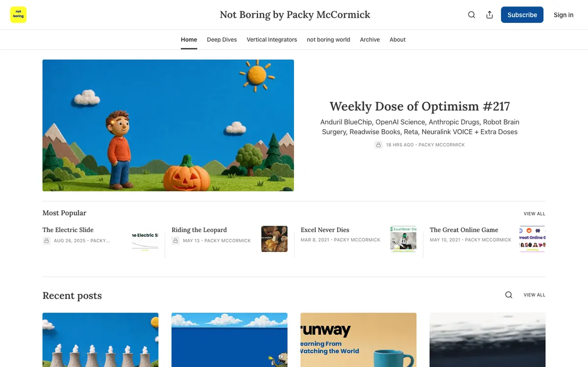
    • The lead image is a clay-style scene with a boy and a carved pumpkin, which gives a weekly roundup its own friendly look.
    • The subtitle under “Weekly Dose of Optimism #217” lists the topics inside (“Anduril BlueChip”, “OpenAI Science”, “Neuralink VOICE”), so a reader sees what the issue covers without opening it.
    • The menu is built around the author’s own series, “Deep Dives”, “Vertical Integrators” and “not boring world”, next to “Archive” and “About”.
    Visit Not Boring(opens in a new tab)
  • Noahpinion homepage: wide featured post with a dark photo, a Latest/Top/Discussions list and a Recommendations sidebar

    Noahpinion

    noahpinion.blog · Substack

    Noah Smith’s newsletter on economics and other interesting stuff.

    What makes it work

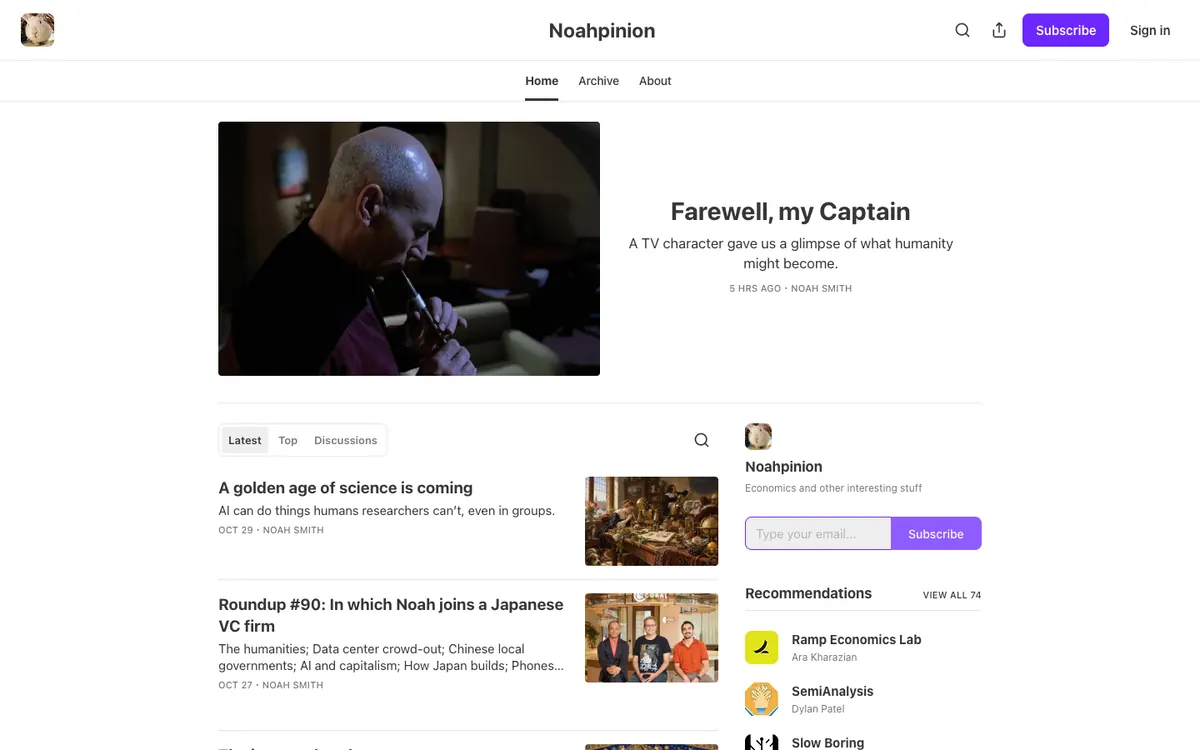
    • A “Recommendations” box in the sidebar lists other newsletters such as “SemiAnalysis” and “Slow Boring” with a “View all 74” link, which sends readers on to related writers.
    • A three-tab switch (“Latest”, “Top”, “Discussions”) sits above the post list, so readers can change how posts are sorted without leaving the page.
    • Each post row pairs a bold headline and a one-line summary with a small square thumbnail on the right, such as “A golden age of science is coming”.
    Visit Noahpinion(opens in a new tab)
  • The Pragmatic Engineer homepage: series menu, a hero with a hand-drawn flowchart and a post list beside a sidebar

    The Pragmatic Engineer

    newsletter.pragmaticengineer.com · Substack

    Gergely Orosz on Big Tech and startup engineering, written for software engineers.

    What makes it work

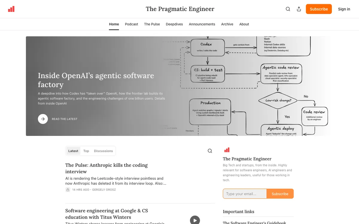
    • The hero is a banner with a hand-drawn flowchart of a software process behind the headline “Inside OpenAI’s agentic software factory”, which previews the technical depth of the post.
    • The menu splits the writing into series and formats (“Podcast”, “The Pulse”, “Deepdives”, “Announcements”), so regular readers can go straight to the kind of post they like.
    • The sidebar states who the newsletter is for (“software engineers, AI engineers and engineering leaders”) above an email box and an “Important links” list.
    Visit The Pragmatic Engineer(opens in a new tab)
No blog yet? Get one free with Outrank BlogsFree
A fast, SEO-ready blog on your own domain, live in one minute. Outrank publishes your articles to it automatically.
Create your blog for free

More blog examples by niche

See all blog examples
background

Your turn

Found a style you like? Start a blog like this, free.