

Student and education blog examples: 9 real blogs and what makes them work

The best student blogs sound like students. MIT Admissions shows each writer’s drawn avatar and class year, Tufts splits its blogs into student and staff voices, and We Are Teachers lets educators filter the whole site by grade level. More blog examples for students

Every blog checked live on . Notes describe only what you can see on the homepage.

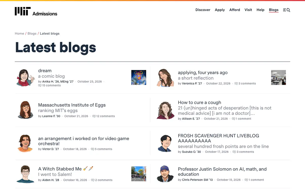
  • MIT Admissions Latest blogs page: two columns of posts, each with a cartoon avatar of the student, a title and a comment count

    MIT Admissions Blogs

    mitadmissions.org/blogs · WordPress

    Posts by MIT students about life on campus, on the admissions site.

    What makes it work

    • Every post shows the student’s drawn avatar, first name and class year.
    • Lowercase, casual titles with a gray subtitle (“Massachusetts Institute of Eggs: ranking MIT’s eggs”) sound like students, not marketing.
    • Comment counts appear on every post in the list.
    Visit MIT Admissions Blogs(opens in a new tab)
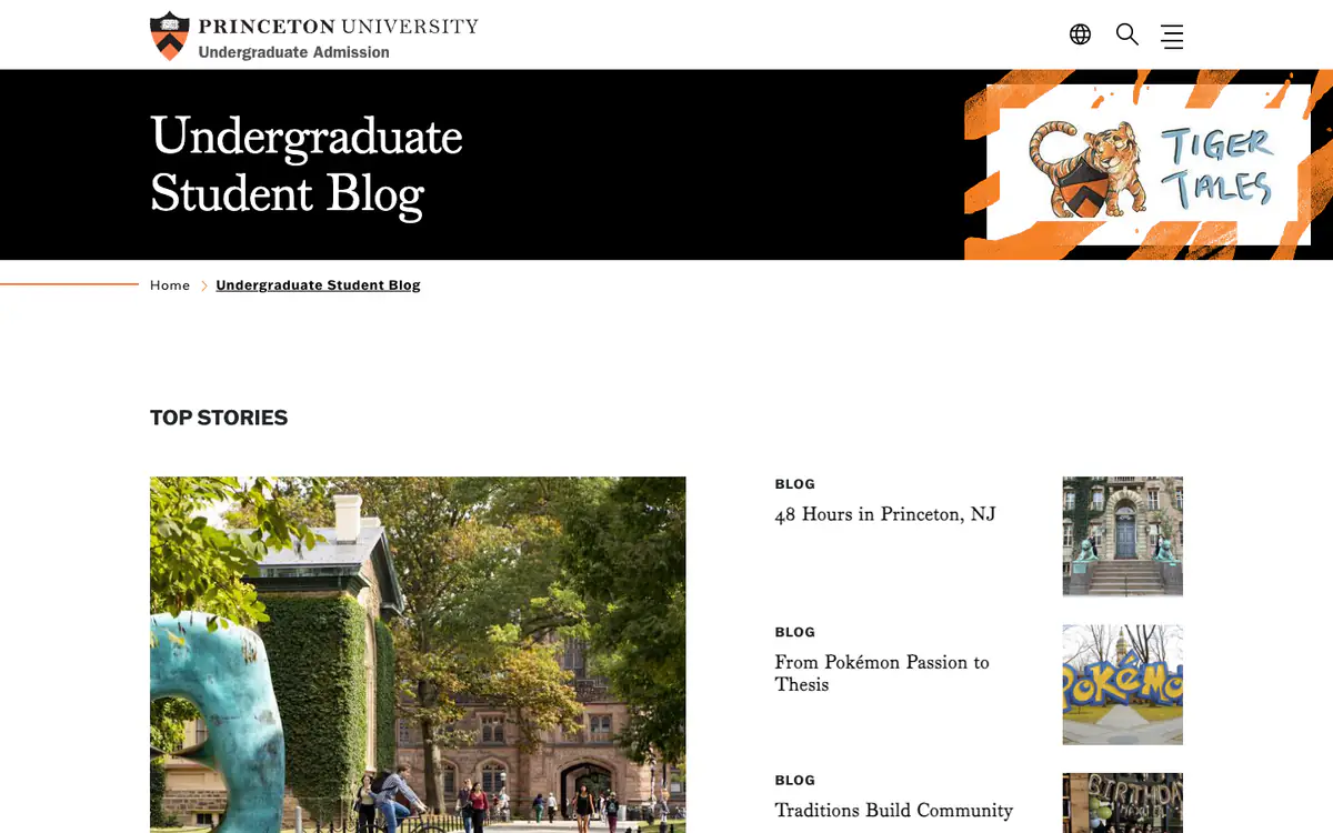
  • Princeton Undergraduate Student Blog: black banner with a Tiger Tales badge, a campus photo and a list of top stories

    Princeton Undergraduate Student Blog

    admission.princeton.edu/undergraduate-student-blog · Drupal

    The undergraduate student blog on Princeton’s admission site.

    What makes it work

    • A hand-drawn “Tiger Tales” badge gives the student blog its own identity inside the university website.
    • “Top Stories” pairs a large campus photo with a list of posts, each with a small square photo.
    • Titles are specific and personal: “48 Hours in Princeton, NJ”, “From Pokémon Passion to Thesis”.
    Visit Princeton Undergraduate Student Blog(opens in a new tab)
  • One Useful Thing homepage: a wave illustration with a chart as the featured post, the latest posts and an email box

    One Useful Thing

    oneusefulthing.org · Substack

    Professor Ethan Mollick’s newsletter about AI at work and in education.

    What makes it work

    • The sidebar sums up the topic and the author’s credential in one line, ending “By Prof. Ethan Mollick”.
    • A menu tab promotes his new book (“My new book: Co-Existence”).
    • The featured post is chart-led (“30 Months on the Exponential (in Charts)”), and every title has a short subtitle.
    Visit One Useful Thing(opens in a new tab)
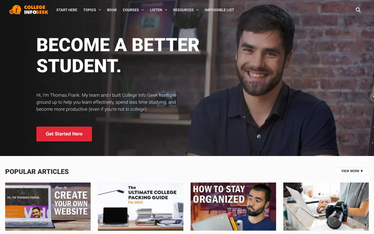
  • College Info Geek homepage: dark hero with Thomas Frank’s photo and a Become a Better Student headline, and popular articles

    College Info Geek

    collegeinfogeek.com · WordPress

    Study and productivity advice for students, from Thomas Frank and his team.

    What makes it work

    • A full-width hero with the founder’s photo, a bold promise (“Become a better student.”) and a red “Get Started Here” button.
    • The intro says who it is for in one sentence, including people who are not in college.
    • “Popular Articles” uses video-style thumbnails with bold text overlays.
    Visit College Info Geek(opens in a new tab)
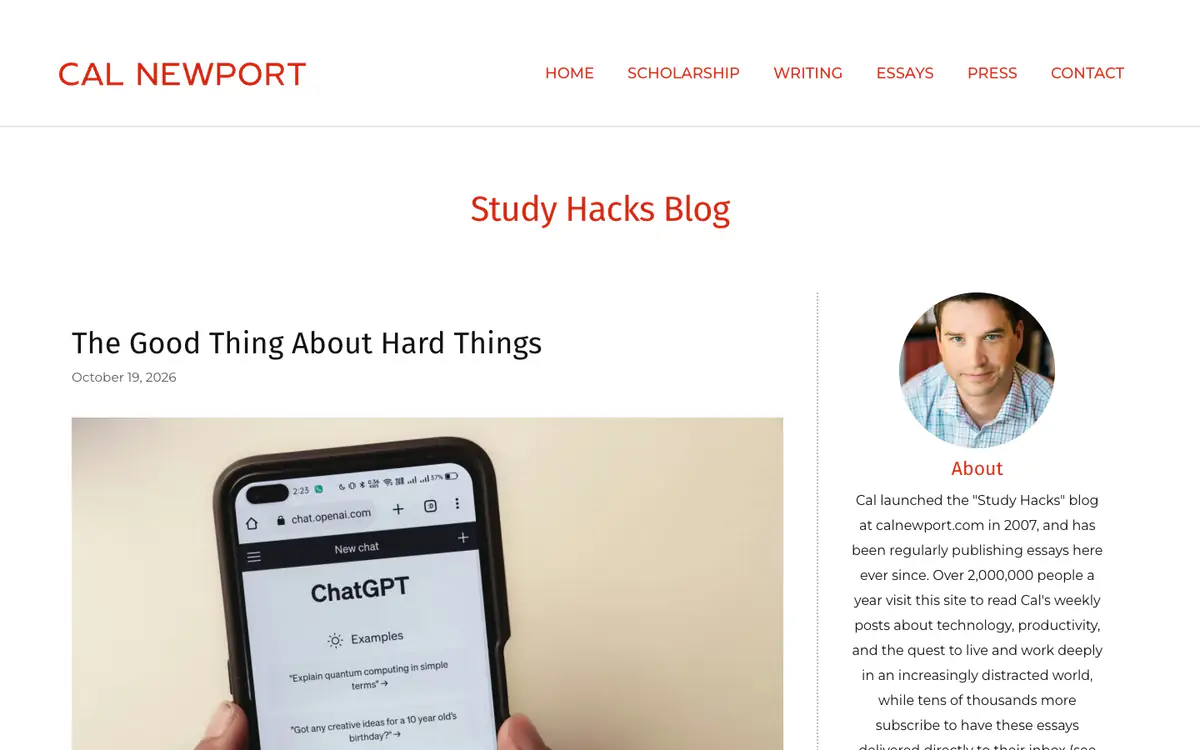
  • Cal Newport’s Study Hacks Blog: red name and menu, a post with a phone showing ChatGPT, and an about box with his photo

    Cal Newport

    calnewport.com/blog · WordPress

    Study Hacks, the blog Cal Newport started in 2007, about technology and deep work.

    What makes it work

    • The blog keeps its original name, “Study Hacks Blog”, as the page title.
    • The about box says when the blog started and how many people read it each year.
    • One post at a time, with a date and a single image, and the author’s round photo in the sidebar.
    Visit Cal Newport(opens in a new tab)
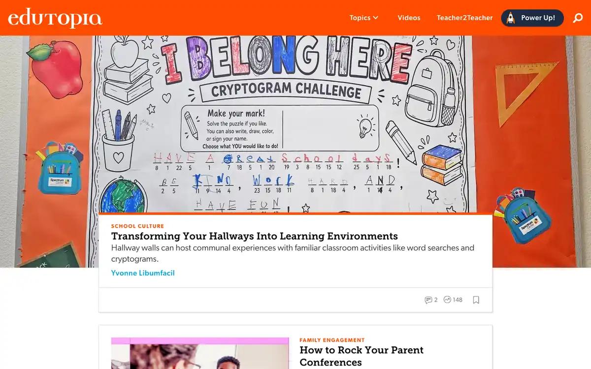
  • Edutopia homepage: orange header, a full-width classroom photo with a lead story card on top and a second story below

    Edutopia

    edutopia.org · WordPress

    Practical ideas for teachers on school culture, family engagement and learning.

    What makes it work

    • The lead story runs full width over a big classroom photo, with a white card on top showing the tag “School Culture”, the headline, a short summary and the author’s name.
    • The orange header keeps navigation to “Topics”, “Videos”, “Teacher2Teacher” and a “Power Up!” button, so readers are not met with a long menu.
    • The next story card pairs a photo with a small orange category tag (“Family Engagement”) and a bold headline, which keeps the feed easy to scan.
    Visit Edutopia(opens in a new tab)
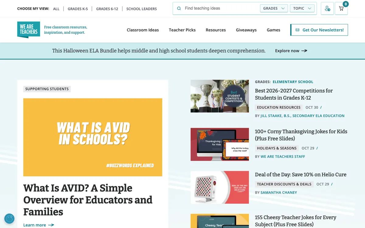
  • We Are Teachers homepage: grade filter bar, search with dropdowns, a large lead story graphic and a thumbnail list on the right

    We Are Teachers

    weareteachers.com · WordPress

    Free classroom ideas, resources and jokes for teachers at every grade level.

    What makes it work

    • A “Choose my view” bar at the very top lets readers switch between “All”, “Grades K-5”, “Grades 6-12” and “School Leaders” before they read anything.
    • The search box (“Find teaching ideas”) has “Grades” and “Topic” dropdowns beside it, so teachers can narrow results to what they actually teach.
    • The lead story is a big yellow graphic (“What Is AVID in Schools?”) next to a list of thumbnails, each with a category chip, a date and a byline.
    Visit We Are Teachers(opens in a new tab)
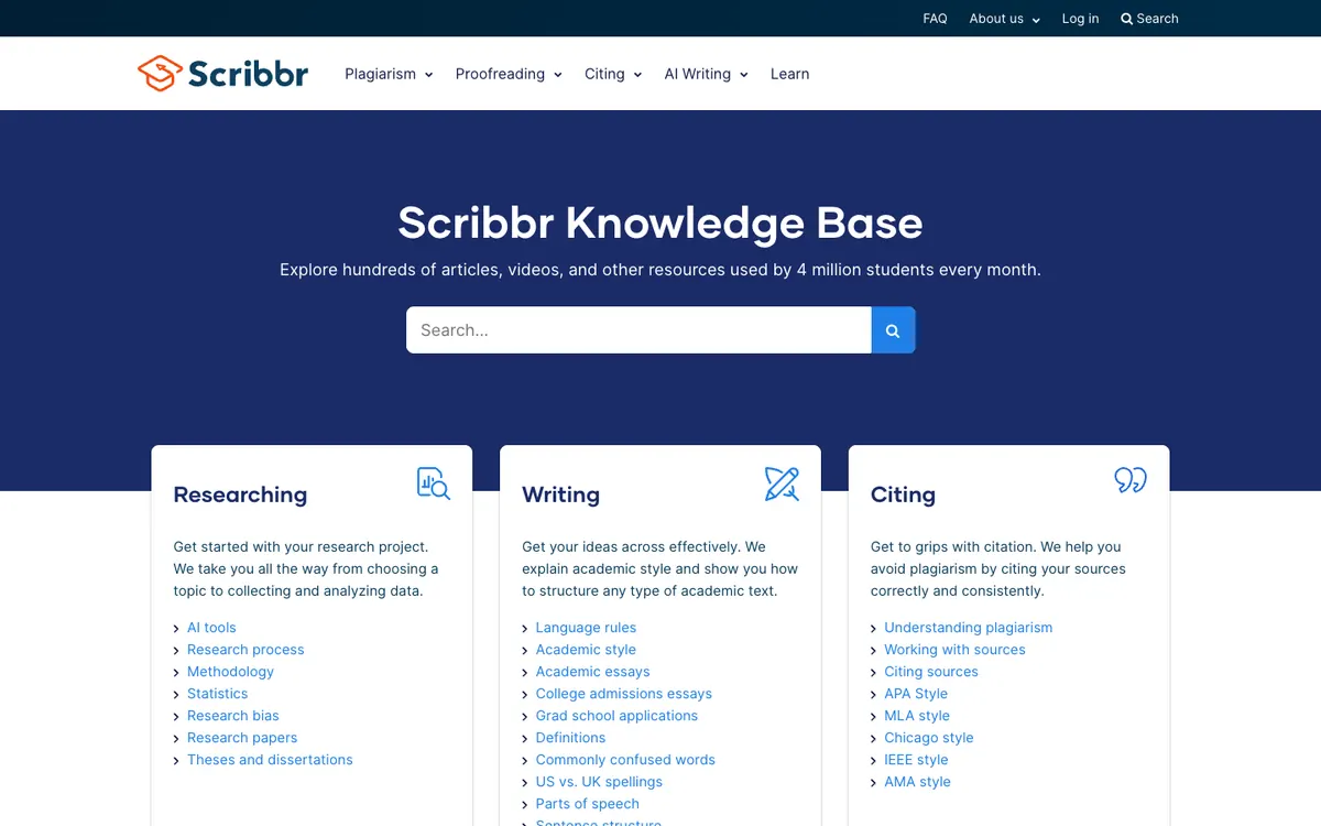
  • Scribbr Knowledge Base homepage: dark blue hero with a search box and three topic cards for Researching, Writing and Citing

    Scribbr Knowledge Base

    scribbr.com/knowledge-base · WordPress

    A student guide to researching, writing and citing, from topic choice to APA style.

    What makes it work

    • Instead of a feed of latest posts, the page is built from topic cards (“Researching”, “Writing”, “Citing”), each with an icon and a short line on what it covers.
    • Each card lists its main subtopics as links, such as “Research process”, “Academic essays” and “APA Style”, so a reader can jump to one guide in a single click.
    • A large search box sits in the dark blue hero under the headline, and the subtitle says the library is “used by 4 million students every month”.
    Visit Scribbr Knowledge Base(opens in a new tab)
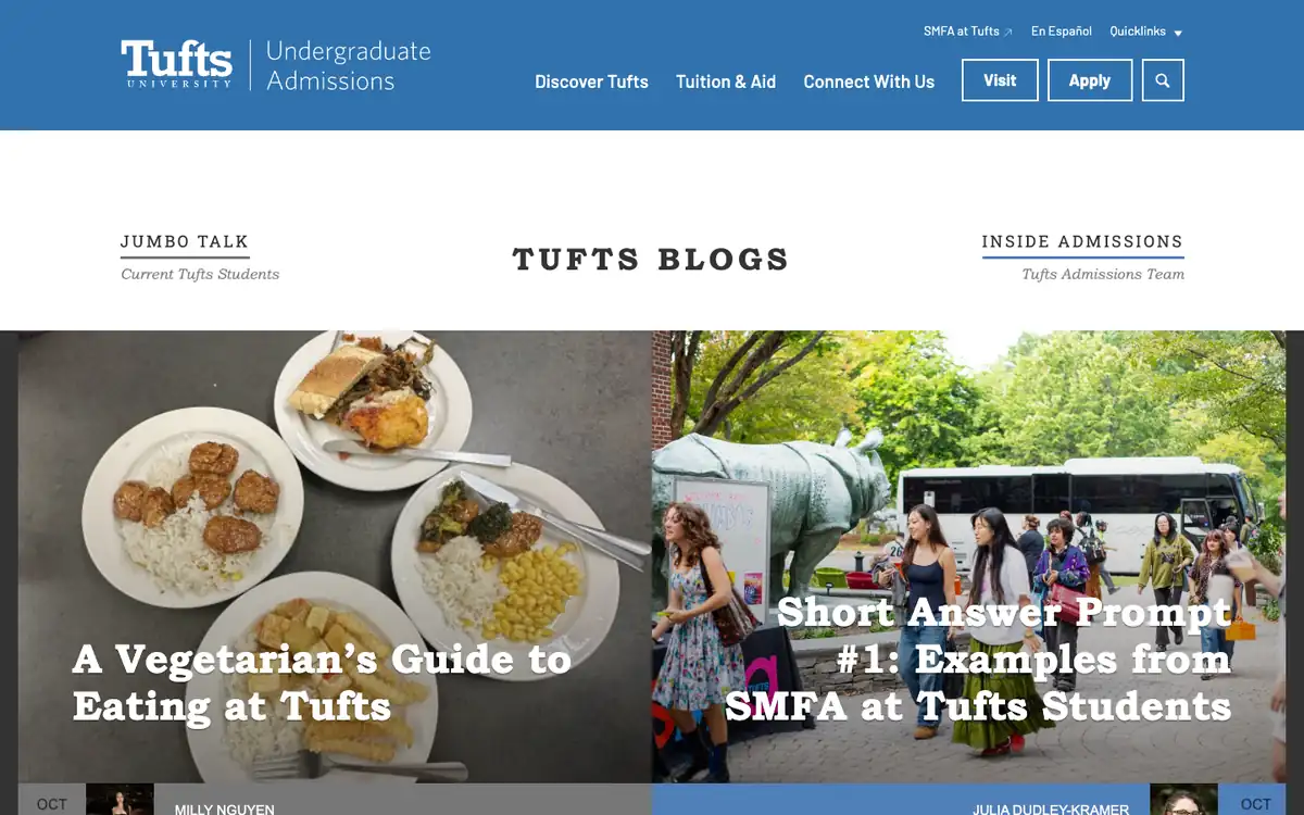
  • Tufts Admissions Blogs homepage: blue header, two blog labels and two large photo tiles for the newest posts

    Tufts Admissions Blogs

    admissions.tufts.edu/blogs

    Tufts undergraduate admissions blogs by current students and the admissions team.

    What makes it work

    • The page header splits the site into two blogs, “Jumbo Talk” (“Current Tufts Students”) and “Inside Admissions” (“Tufts Admissions Team”), so readers choose the voice they want.
    • Two large photo tiles show the newest post from each blog, with headlines such as “A Vegetarian’s Guide to Eating at Tufts” set in big serif type over the image.
    • The blue top bar keeps “Visit” and “Apply” buttons plus “Tuition & Aid” in view, so a reader can take the next step without leaving the blog.
    Visit Tufts Admissions Blogs(opens in a new tab)
No blog yet? Get one free with Outrank BlogsFree
A fast, SEO-ready blog on your own domain, live in one minute. Outrank publishes your articles to it automatically.
Create your blog for free

More blog examples by niche

See all blog examples
background

Your turn

Found a style you like? Start a blog like this, free.