

Travel blog examples: 8 real blogs and what makes them work

A travel blog works like a guidebook with a narrator. Nomadic Matt leads with a destination search box, while Adventurous Kate and Be My Travel Muse introduce the traveler first, so readers know whose advice they are taking. How to write a travel blog

Every blog checked live on . Notes describe only what you can see on the homepage.

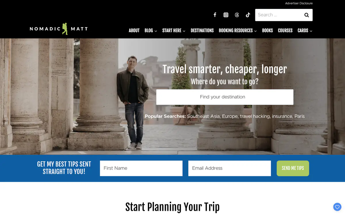
  • Nomadic Matt homepage: photo of Matt between stone columns with a destination search box and a blue email signup bar

    Nomadic Matt

    nomadicmatt.com · WordPress

    Budget travel advice built around one promise: travel smarter, cheaper, longer.

    What makes it work

    • The hero is a destination search box (“Find your destination”) with popular searches like Southeast Asia and travel hacking.
    • A full-width blue bar right under the hero asks for a first name and email (“Send me tips”).
    • “Start Here” in the main menu gives new readers an obvious first click.
    Visit Nomadic Matt(opens in a new tab)
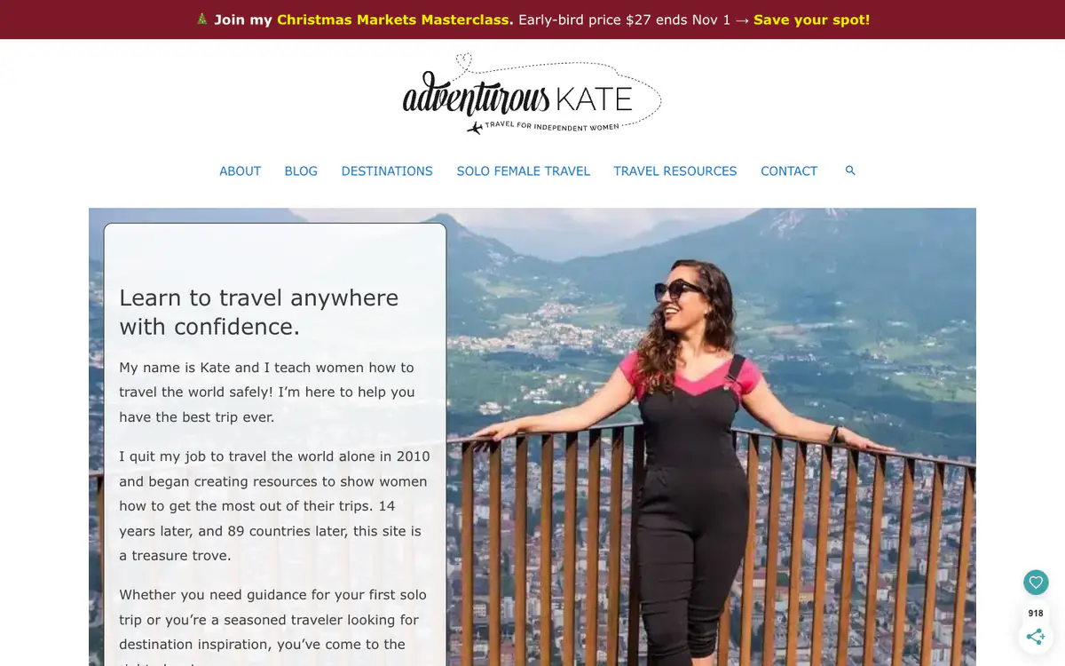
  • Adventurous Kate homepage: script logo, a promo bar for a masterclass and a hero photo of Kate beside a welcome text box

    Adventurous Kate

    adventurouskate.com · WordPress

    Solo female travel guides and destination advice.

    What makes it work

    • The hero pairs Kate’s photo with a first-person intro: who she helps and how it started (“I quit my job to travel the world alone in 2010”).
    • The menu is built around her niche: Solo Female Travel, Destinations, Travel Resources.
    • A top bar sells a paid masterclass with an early-bird price and a deadline.
    Visit Adventurous Kate(opens in a new tab)
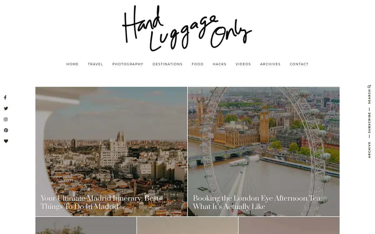
  • Hand Luggage Only homepage: handwritten logo, spaced menu and two large photo tiles of Madrid and the London Eye

    Hand Luggage Only

    handluggageonly.co.uk · WordPress

    Travel guides, itineraries and photography.

    What makes it work

    • A handwritten script logo sits centered above a spaced-caps menu.
    • Large photo tiles carry the post title in a serif font right on the image.
    • Social icons run down the left edge, and Search, Subscribe and Archive run vertically down the right.
    Visit Hand Luggage Only(opens in a new tab)
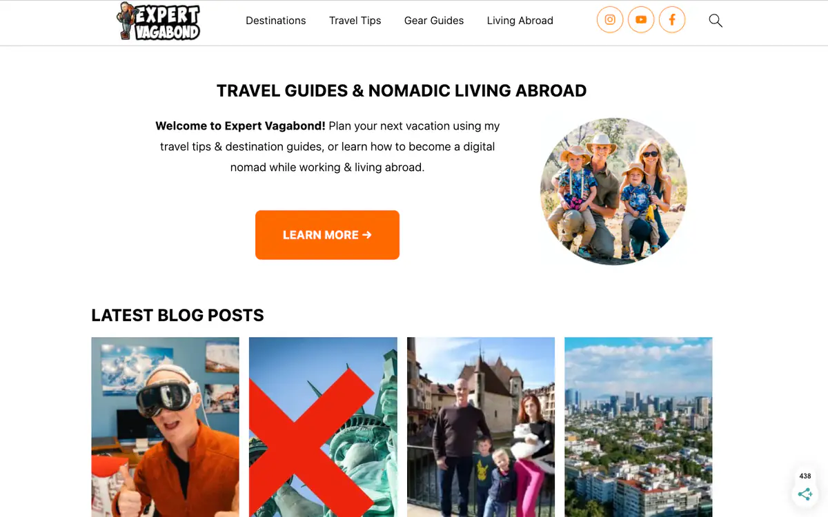
  • Expert Vagabond homepage: welcome text with an orange Learn More button, a round family photo and a row of latest posts

    Expert Vagabond

    expertvagabond.com · WordPress

    Travel guides and advice on living abroad as a digital nomad.

    What makes it work

    • A welcome block with a one-sentence pitch, a round family photo and an orange “Learn more” button comes before any posts.
    • The menu has four topics: Destinations, Travel Tips, Gear Guides, Living Abroad.
    • “Latest Blog Posts” is a row of tall photo cards.
    Visit Expert Vagabond(opens in a new tab)
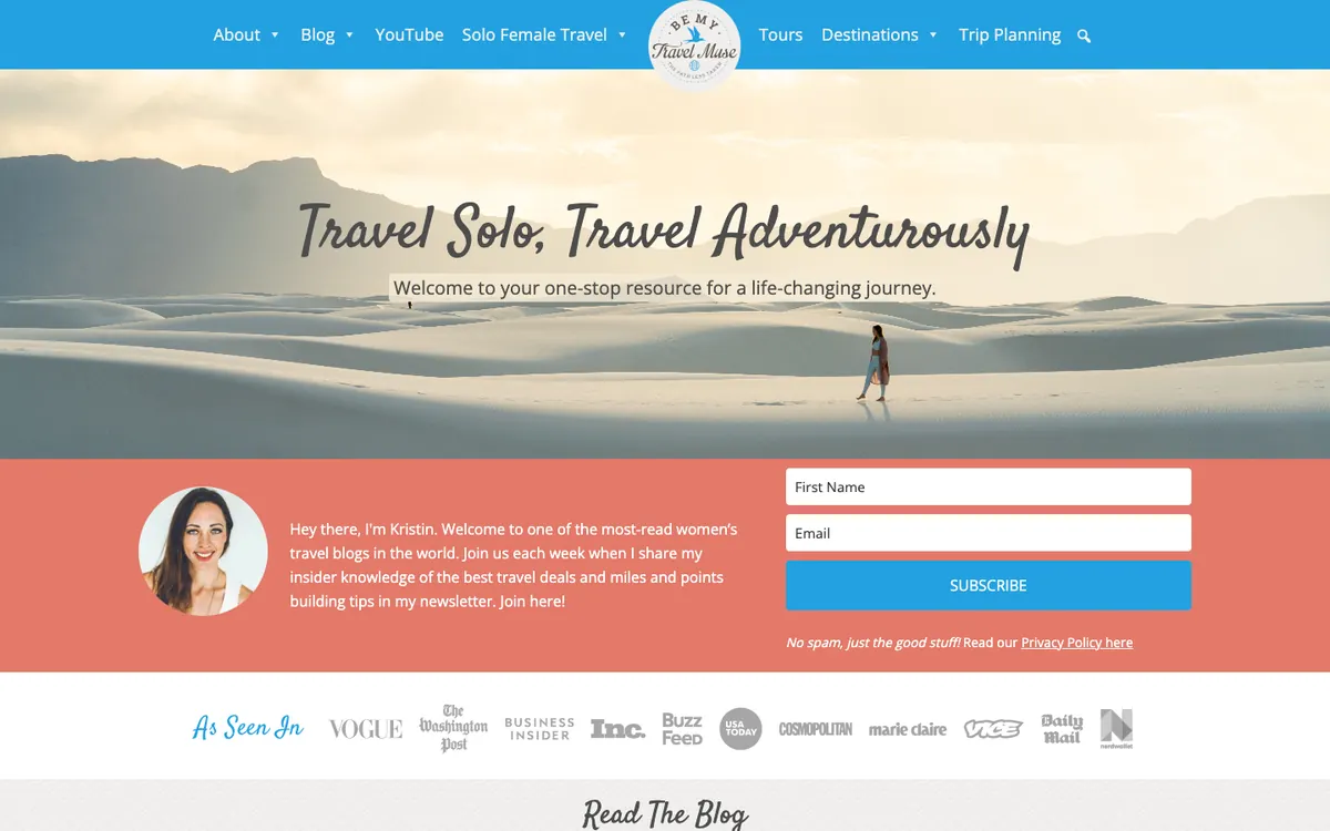
  • Be My Travel Muse homepage: blue menu with a round logo, a desert hero photo, an author intro with a signup form and press logos

    Be My Travel Muse

    bemytravelmuse.com · WordPress

    Solo female travel tips, destination guides and trip planning from Kristin.

    What makes it work

    • Right below the hero, a coral band pairs the author’s photo and a short hello (“Hey there, I’m Kristin.”) with a first name and email form and a “Subscribe” button, so readers meet the writer and can sign up in one spot.
    • The hero is a wide desert photo with a lone walker and the line “Travel Solo, Travel Adventurously” in a script font, which sets the tone for the whole site.
    • An “As Seen In” row of press logos (Vogue, The Washington Post, Business Insider, Inc., BuzzFeed, USA Today) adds credibility, and a “Read The Blog” heading starts just below it.
    Visit Be My Travel Muse(opens in a new tab)
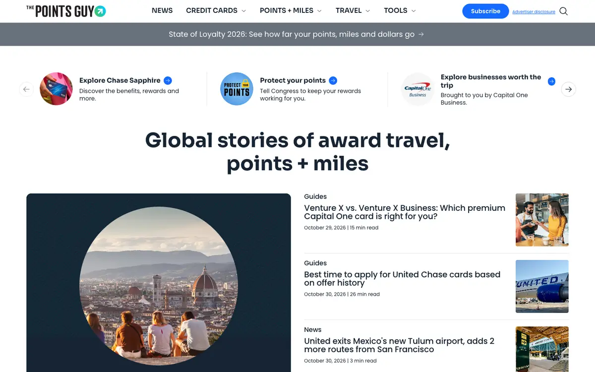
  • The Points Guy homepage: menu with a Subscribe button, promo cards, a large headline and a list of guides with read times

    The Points Guy

    thepointsguy.com · Custom-built · Next.js

    News and guides on points, miles, credit cards and award travel.

    What makes it work

    • A headline, “Global stories of award travel, points + miles”, leads into a large photo card and a list of articles that each show a type label (“Guides”, “News”), a date, minutes to read and a small thumbnail.
    • The menu (“News”, “Credit Cards”, “Points + Miles”, “Travel”, “Tools”) uses dropdowns and a blue “Subscribe” button, and a grey banner below promotes “State of Loyalty 2026”.
    • A row of three promo cards with round icons (“Explore Chase Sapphire”, “Protect your points”, “Explore businesses worth the trip”) comes before the stories, with arrows to scroll through more.
    Visit The Points Guy(opens in a new tab)
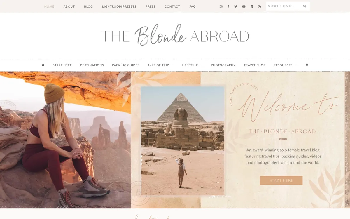
  • The Blonde Abroad homepage: script logo, two menu bars and a collage hero with a hiker, the Sphinx and a Start Here button

    The Blonde Abroad

    theblondeabroad.com · WordPress

    Solo female travel tips, packing guides and photography from Kiersten.

    What makes it work

    • The hero is a collage with a woman on red rocks, a traveler by the Sphinx and a pale card reading “Welcome to The Blonde Abroad” with a tan “START HERE” button, so first-time visitors get a clear way in.
    • The main menu lists “START HERE”, “DESTINATIONS”, “PACKING GUIDES”, “TYPE OF TRIP”, “LIFESTYLE”, “PHOTOGRAPHY”, “TRAVEL SHOP” and “RESOURCES”, which sorts the site by what a traveler needs to plan.
    • A script-style logo sits centered above the menu, with a thin top bar for “ABOUT”, “BLOG”, “LIGHTROOM PRESETS”, “PRESS”, “CONTACT” and “FAQ”, plus social icons and a search box.
    Visit The Blonde Abroad(opens in a new tab)
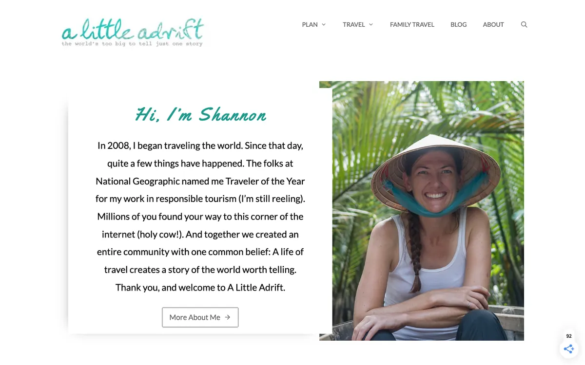
  • A Little Adrift homepage: handwritten logo, a menu and a Hi, I’m Shannon welcome card beside a smiling traveler in a conical hat

    A Little Adrift

    alittleadrift.com · WordPress

    Travel guides and trip planning advice from Shannon.

    What makes it work

    • The hero is a personal welcome, “Hi, I’m Shannon”, with a short travel story beside a smiling photo in a conical hat and a “More About Me” button, so readers meet the person before the posts.
    • The menu groups the site into “PLAN”, “TRAVEL”, “FAMILY TRAVEL”, “BLOG” and “ABOUT”, with small arrows showing dropdowns under “PLAN” and “TRAVEL”.
    • A teal handwritten logo with the line “the world’s too big to tell just one story” sits at the top left, and a white text card overlaps the photo on the right.
    Visit A Little Adrift(opens in a new tab)
No blog yet? Get one free with Outrank BlogsFree
A fast, SEO-ready blog on your own domain, live in one minute. Outrank publishes your articles to it automatically.
Create your blog for free

More blog examples by niche

See all blog examples
background

Your turn

Found a style you like? Start a blog like this, free.