

Tech and developer blog examples: 10 real blogs and what makes them work

Developers want the writing fast, and many of the best tech blogs are almost plain text. Overreacted is a single list of posts, Julia Evans puts every post on one page, and Josh W. Comeau shows that a friendly illustrated hero works too.

Every blog checked live on . Notes describe only what you can see on the homepage.

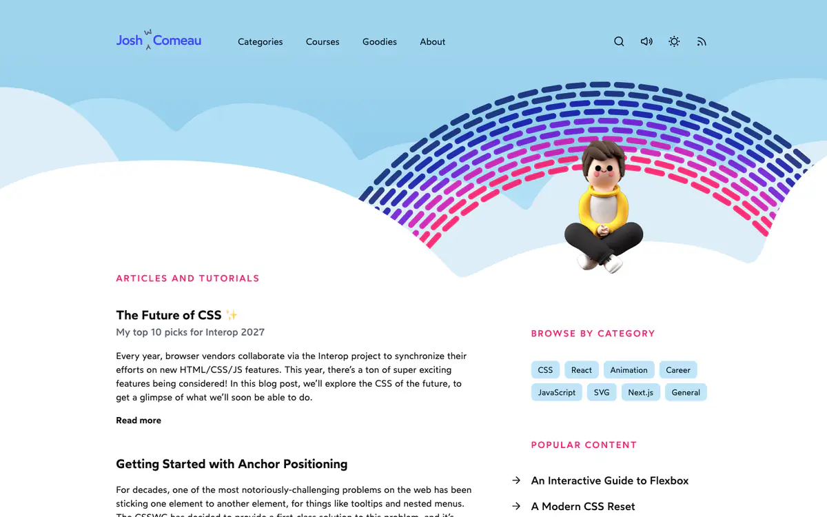
  • Josh W. Comeau homepage: illustrated hero with a 3D avatar under a rainbow arc, an article list and category tags

    Josh W. Comeau

    joshwcomeau.com · Custom-built · Next.js

    Articles and tutorials on CSS, React and animation.

    What makes it work

    • An illustrated hero with a 3D version of Josh under a rainbow arc gives a technical blog a friendly, personal feel.
    • The sidebar has “Browse by category” tag pills (CSS, React, Animation, Career) and a “Popular content” list.
    • Header icons for search, sound, light or dark theme and RSS put reader settings one click away.
    Visit Josh W. Comeau(opens in a new tab)
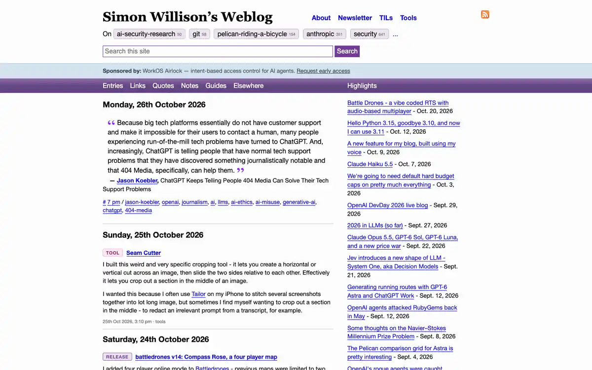
  • Simon Willison’s Weblog homepage: serif title, topic tags with counts, a dated stream of posts and a Highlights sidebar

    Simon Willison’s Weblog

    simonwillison.net

    A daily blog about AI, LLMs and building software.

    What makes it work

    • Topic tags with post counts sit under the title, a quick map of what the blog covers.
    • Entries, links, quotes, notes and tools share one stream grouped by day, each with a type label like Tool or Release.
    • A “Highlights” sidebar lists the longer posts with their dates.
    Visit Simon Willison’s Weblog(opens in a new tab)
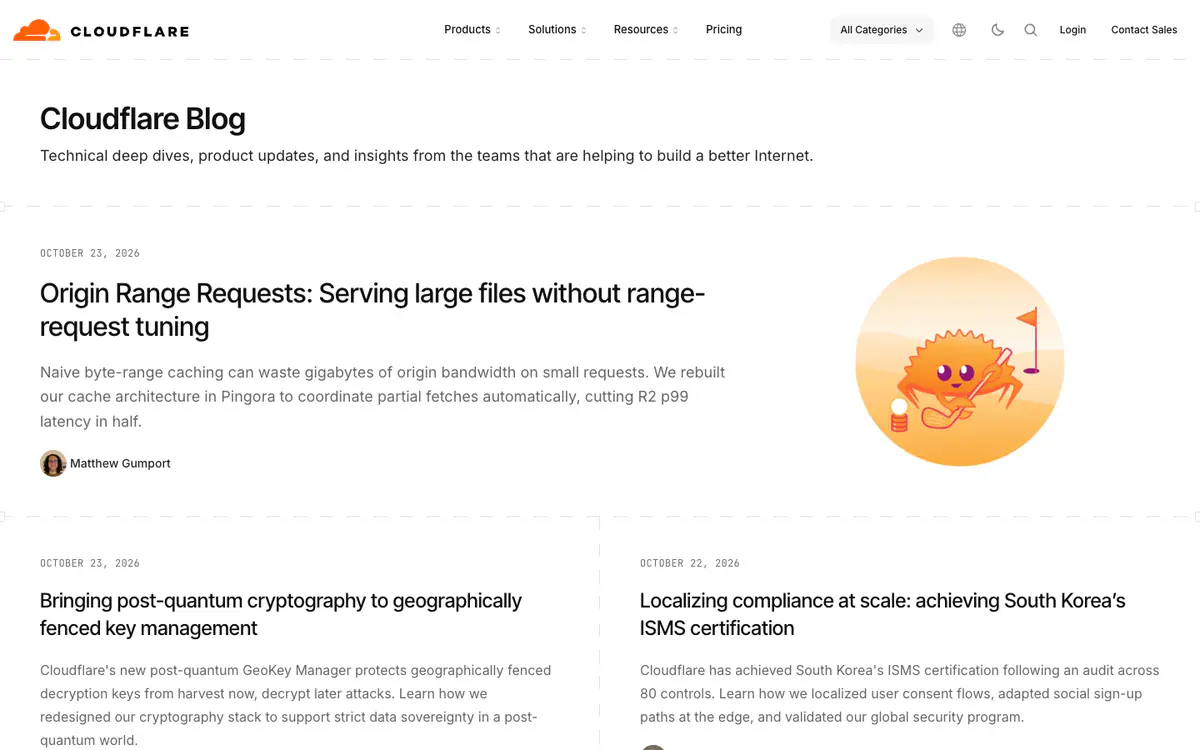
  • Cloudflare Blog homepage: title and description, a featured post with a crab mascot illustration and a two-column post list

    The Cloudflare Blog

    blog.cloudflare.com · Custom-built · Astro

    Technical deep dives, product updates and insights from Cloudflare’s teams.

    What makes it work

    • Monospace date labels above each headline give the page an engineering feel.
    • The featured post pairs a two-sentence summary with a playful mascot illustration.
    • An “All Categories” dropdown sits in the header next to dark mode and search.
    Visit The Cloudflare Blog(opens in a new tab)
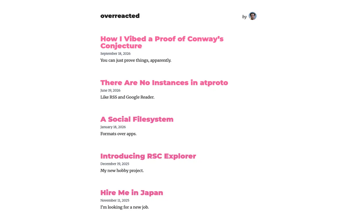
  • Overreacted homepage: white page with a single column of pink post titles, dates and one-line subtitles

    Overreacted

    overreacted.io · Custom-built · Next.js

    A personal blog about programming, kept to a single list of posts.

    What makes it work

    • The homepage is only a list: a bold pink title, a date and a one-line subtitle for each post.
    • No images, sidebar or menu: just the blog name and a small author photo at the top.
    • The subtitles do the selling in a few words (“Like RSS and Google Reader.”).
    Visit Overreacted(opens in a new tab)
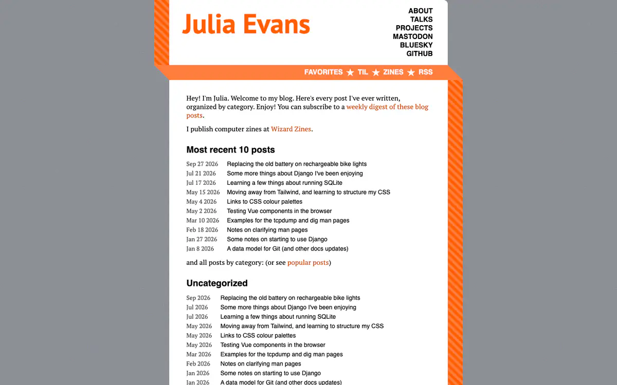
  • Julia Evans blog homepage: orange striped frame, a short welcome and a dated list of the most recent 10 posts

    Julia Evans

    jvns.ca · Hugo

    Short, curious posts about programming tools, plus programming zines.

    What makes it work

    • The welcome line says it all: every post she has written, organized by category, on one page.
    • “Most recent 10 posts” is a plain dated list, followed by all posts by category.
    • The intro links to a weekly digest of the blog and to her zine shop, Wizard Zines.
    Visit Julia Evans(opens in a new tab)
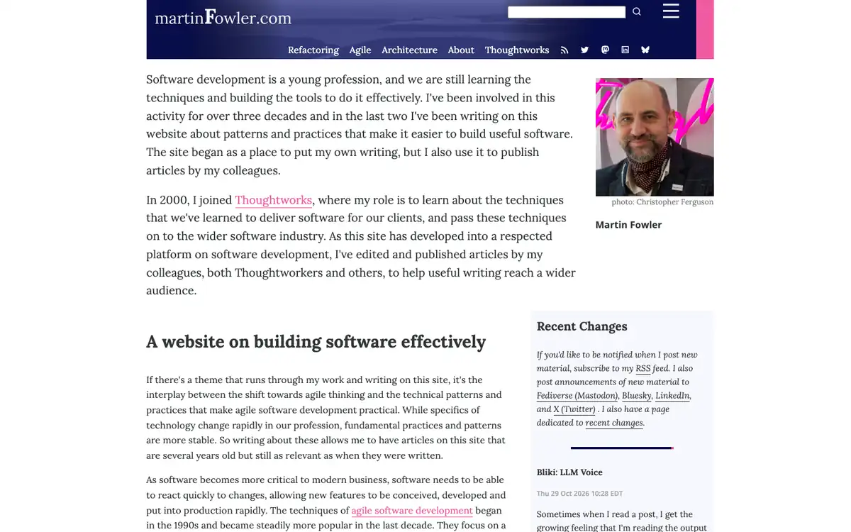
  • martinFowler.com homepage: navy banner with a menu, welcome text beside the author’s photo and a Recent Changes box

    martinFowler.com

    martinfowler.com

    Martin Fowler’s writing on software design, agile and architecture.

    What makes it work

    • The page opens with the author’s own welcome text in a large serif face next to his photo and name, so readers meet the person behind the site before any list of articles.
    • A navy banner holds the site name and a one-line menu (“Refactoring”, “Agile”, “Architecture”, “About”, “Thoughtworks”) with RSS and social icons, all in a small strip.
    • A “Recent Changes” box in the right column shows the newest entry (“Bliki: LLM Voice”, dated 29 Oct 2026) and tells readers they can follow by RSS, Mastodon, Bluesky and LinkedIn.
    Visit martinFowler.com(opens in a new tab)
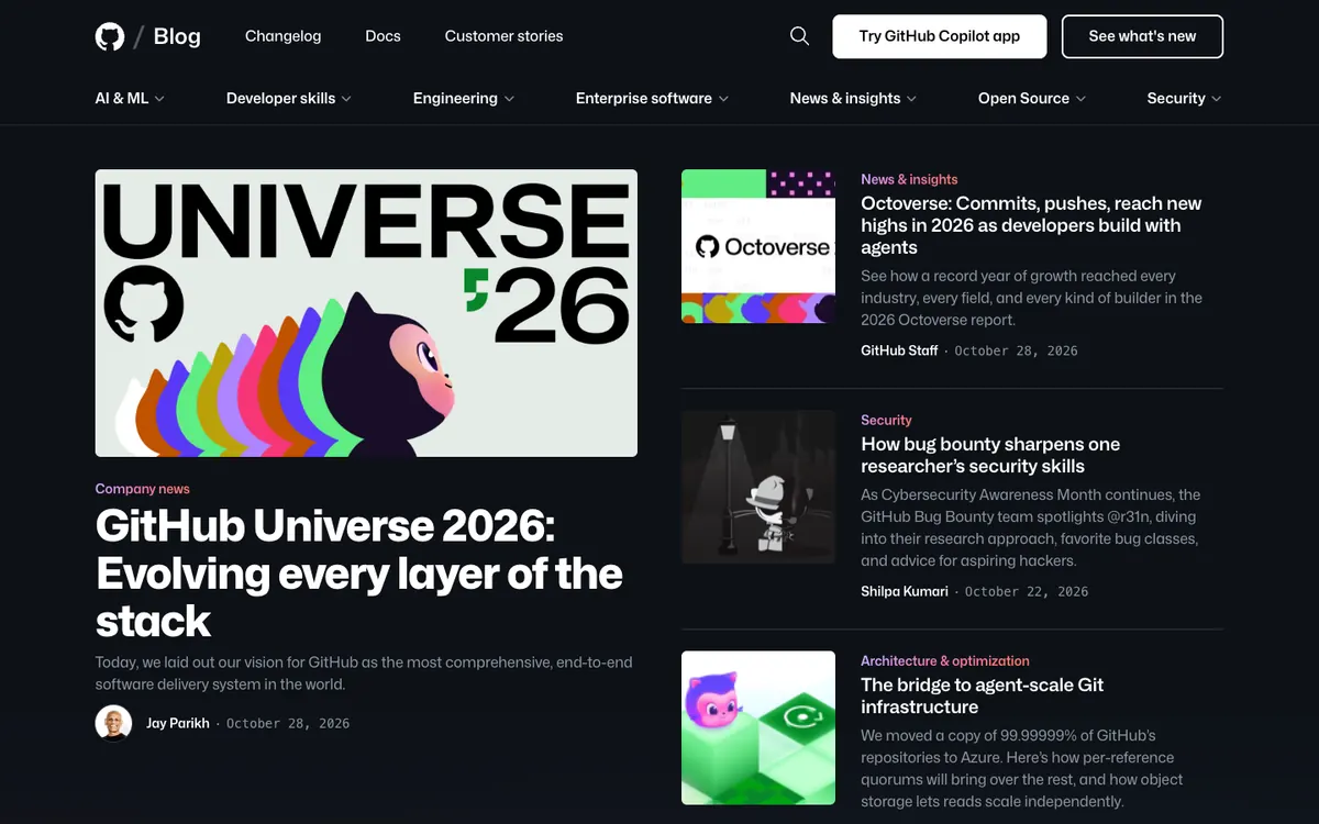
  • The GitHub Blog homepage: dark layout with a topic menu, a large Universe 2026 cover story and summaries on the right

    The GitHub Blog

    github.blog · WordPress

    GitHub’s news, engineering stories, security and open source updates.

    What makes it work

    • The lead story, “GitHub Universe 2026: Evolving every layer of the stack”, uses a large illustrated cover with the Octocat and a big white headline on a dark page.
    • Stories on the right pair a small image with a colored category label (“News & insights”, “Security”, “Architecture & optimization”), a short summary, and the author and date.
    • A second row of dropdown menus (“AI & ML”, “Developer skills”, “Engineering”, “Enterprise software”, “Open Source”, “Security”) sits under the main bar next to “Changelog”, “Docs” and “Customer stories”.
    Visit The GitHub Blog(opens in a new tab)
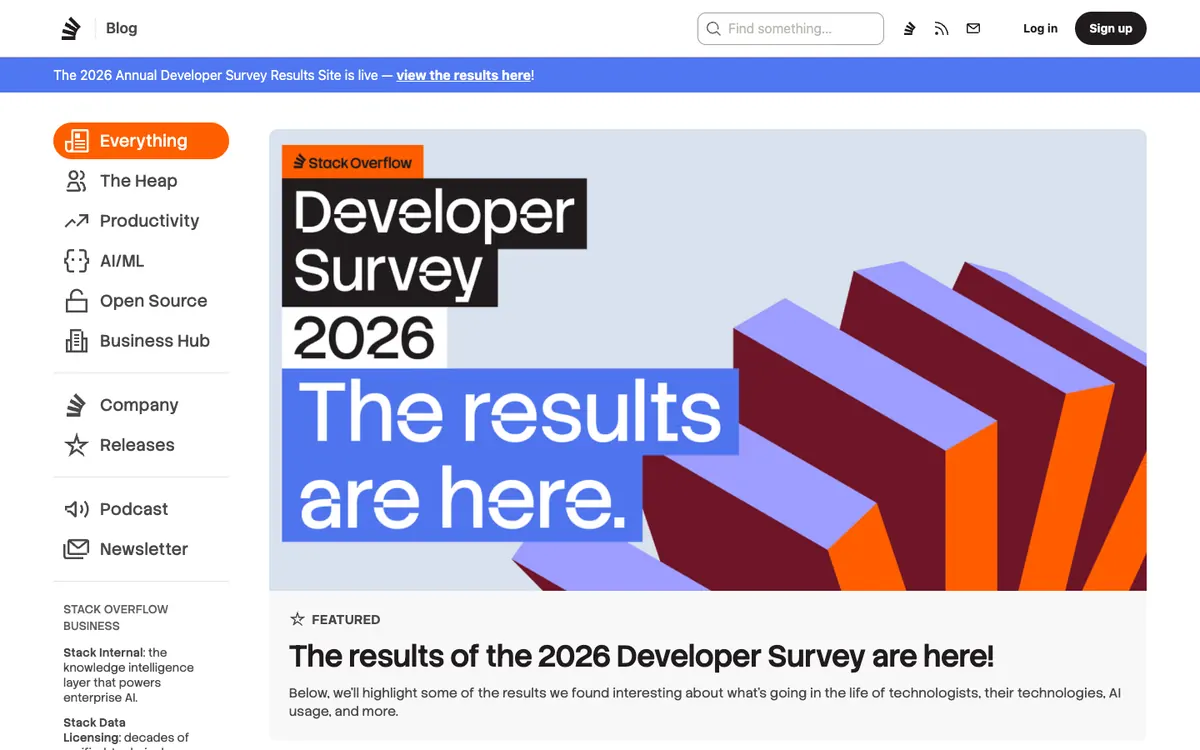
  • The Stack Overflow Blog homepage: icon topic sidebar on the left, a blue notice bar and a large Developer Survey 2026 feature

    The Stack Overflow Blog

    stackoverflow.blog

    Stack Overflow’s blog on software teams, AI, open source and productivity.

    What makes it work

    • A left sidebar with icons lists topics (“Everything”, “The Heap”, “Productivity”, “AI/ML”, “Open Source”, “Business Hub”) plus “Podcast” and “Newsletter”, so the blog’s structure stays on screen.
    • A blue banner under the header (“The 2026 Annual Developer Survey Results Site is live”) points readers to a related page without hiding the blog.
    • The featured post uses a very large branded graphic (“Developer Survey 2026 The results are here.”) with a “FEATURED” label and a two-line summary below it.
    Visit The Stack Overflow Blog(opens in a new tab)
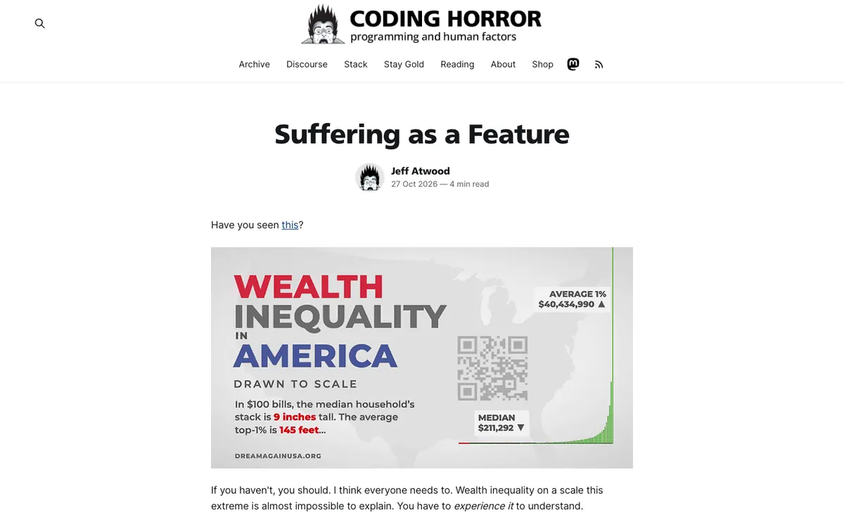
  • Coding Horror homepage: logo with a mascot and menu, then the latest post title, author line and a large chart image

    Coding Horror

    blog.codinghorror.com · Ghost

    Jeff Atwood’s blog on programming and human factors.

    What makes it work

    • The newest post opens directly on the homepage with a centered bold title, “Suffering as a Feature”, the author’s avatar and name, the date and a “4 min read” label.
    • The logo with a spiky-haired mascot and the line “programming and human factors” sits above a simple menu (“Archive”, “Discourse”, “Stack”, “Stay Gold”, “Reading”, “About”, “Shop”) with Mastodon and RSS icons.
    • The text column is narrow while the post image is wide, and a lot of white space surrounds both, which makes the article easy to read.
    Visit Coding Horror(opens in a new tab)
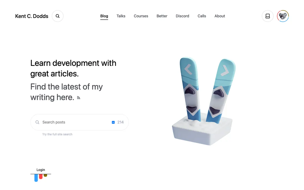
  • Kent C. Dodds blog homepage: simple menu, hero text about learning development, a large search box and a 3D skis image

    Kent C. Dodds

    kentcdodds.com/blog

    Kent C. Dodds’ blog with articles to learn web development.

    What makes it work

    • A big pill-shaped “Search posts” box sits in the hero with “214” at its right edge and a “Try the full site search” link below, so finding an article is the first thing a reader can do.
    • The hero text says “Learn development with great articles. Find the latest of my writing here.”, with an RSS icon after it and a 3D illustration of two skis in snow on the right.
    • The top menu (“Blog”, “Talks”, “Courses”, “Better”, “Discord”, “Calls”, “About”) puts the blog first and shows the author’s other work beside it, with a search icon next to his name.
    Visit Kent C. Dodds(opens in a new tab)
No blog yet? Get one free with Outrank BlogsFree
A fast, SEO-ready blog on your own domain, live in one minute. Outrank publishes your articles to it automatically.
Create your blog for free

More blog examples by niche

See all blog examples
background

Your turn

Found a style you like? Start a blog like this, free.