

Music and film blog examples: 8 real blogs and what makes them work

Music and film blogs have to look current and give a verdict quickly. RogerEbert.com shows a star rating and a one-line verdict in its top story, and Gorilla vs. Bear gives one new song almost the whole first screen.

Every blog checked live on . Notes describe only what you can see on the homepage.

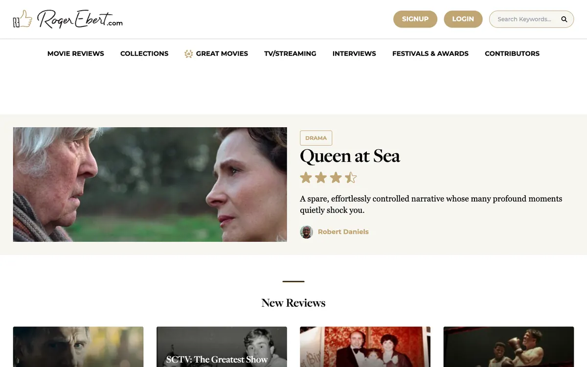
  • RogerEbert.com homepage: script logo, review menu, a featured review with star rating and a row of new review cards

    RogerEbert.com

    rogerebert.com · WordPress

    Movie reviews, interviews and festival coverage from a team of film critics.

    What makes it work

    • The top story is a single review card with a “DRAMA” tag, the title “Queen at Sea”, a star rating, a one-line verdict and the critic’s name, so a reader can judge the film in seconds.
    • The main menu gives each kind of piece its own door, with labels like “MOVIE REVIEWS”, “GREAT MOVIES”, “INTERVIEWS” and “FESTIVALS & AWARDS”.
    • A “New Reviews” row of image cards starts right below the top feature, so more than one fresh review is in view.
    Visit RogerEbert.com(opens in a new tab)
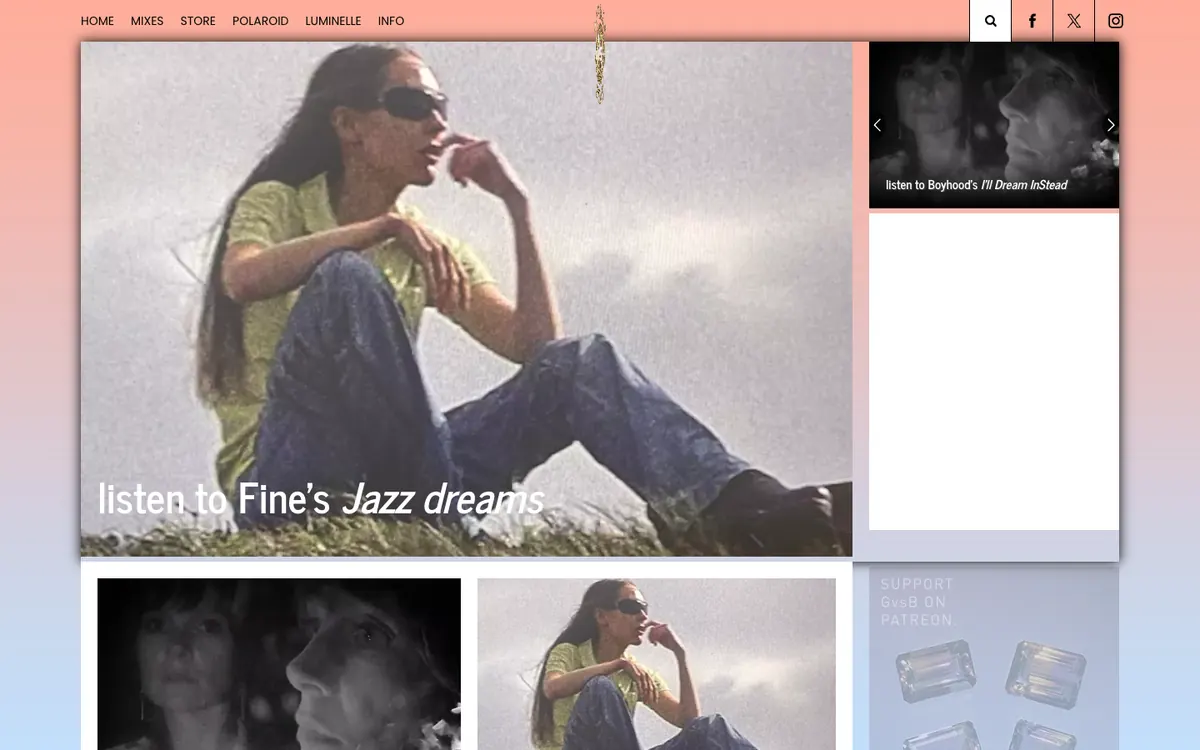
  • Gorilla vs. Bear homepage: pink-blue gradient, large lead photo with “listen to Fine’s Jazz dreams” and a small slider

    Gorilla vs. Bear

    gorillavsbear.net · WordPress

    A music blog that leads with “listen to” posts about new songs.

    What makes it work

    • One large photo takes most of the first screen, with the headline “listen to Fine’s Jazz dreams” set over the image, so the lead story reads like a magazine cover.
    • The page sits on a pink-to-blue gradient background, which gives the blog a look of its own before you read a word.
    • A short menu (“HOME”, “MIXES”, “STORE”, “POLAROID”, “LUMINELLE”, “INFO”) sits beside search and social icons, and a small slider with arrows on the right previews the next post.
    Visit Gorilla vs. Bear(opens in a new tab)
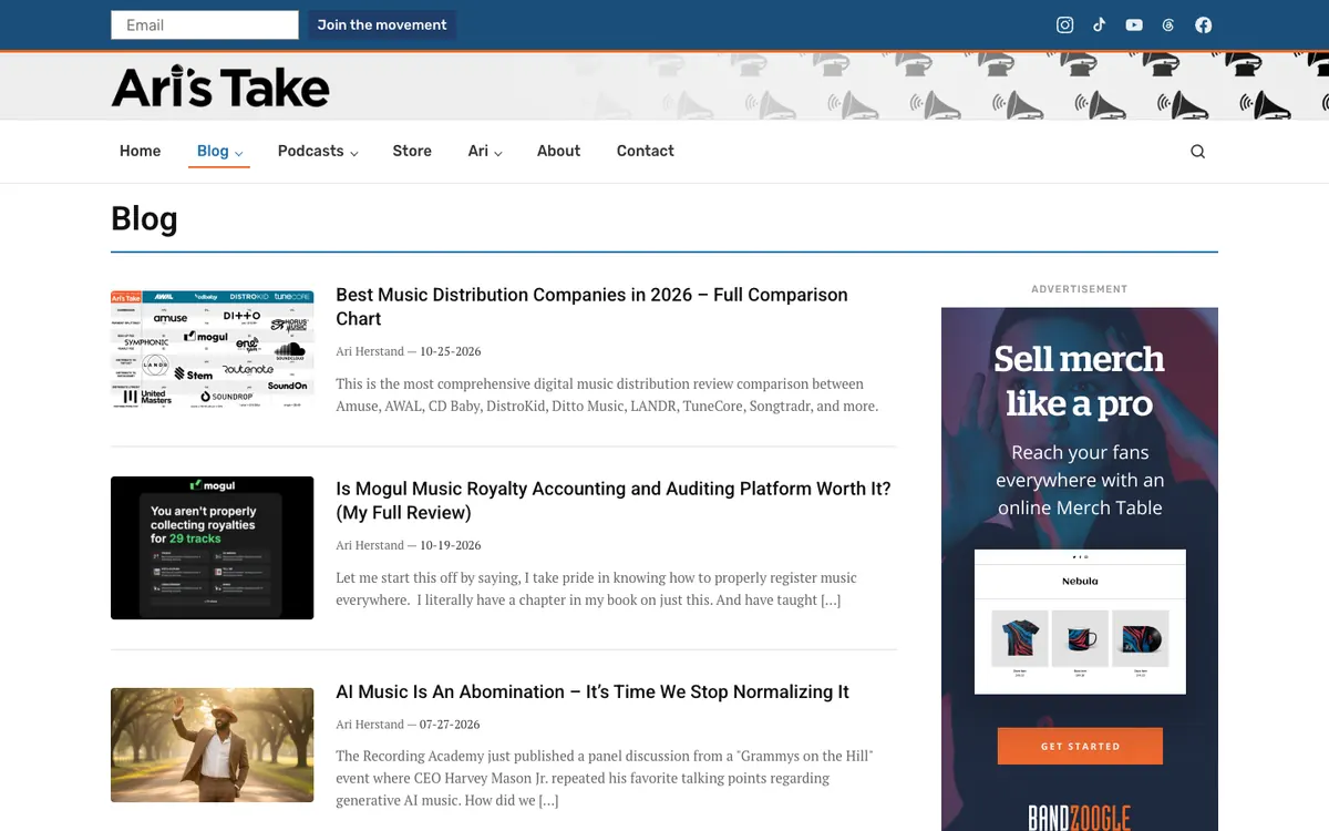
  • Ari’s Take blog page: gramophone-pattern header, post list with thumbnails and excerpts, and a merch ad in the sidebar

    Ari’s Take

    aristake.com/blog · WordPress

    Music business advice, tool reviews and opinion, written by Ari Herstand.

    What makes it work

    • Each post in the list has a thumbnail, a bold headline, a byline with a date and a short excerpt, so readers can scan many posts quickly.
    • A comparison post, “Best Music Distribution Companies in 2026”, leads the list, and its thumbnail is a grid of company logos that shows what the chart covers.
    • The menu has dropdowns for “Blog”, “Podcasts” and “Ari”, plus “Store”, “About” and “Contact”, and an email box with a “Join the movement” button sits in a bar above the logo.
    Visit Ari’s Take(opens in a new tab)
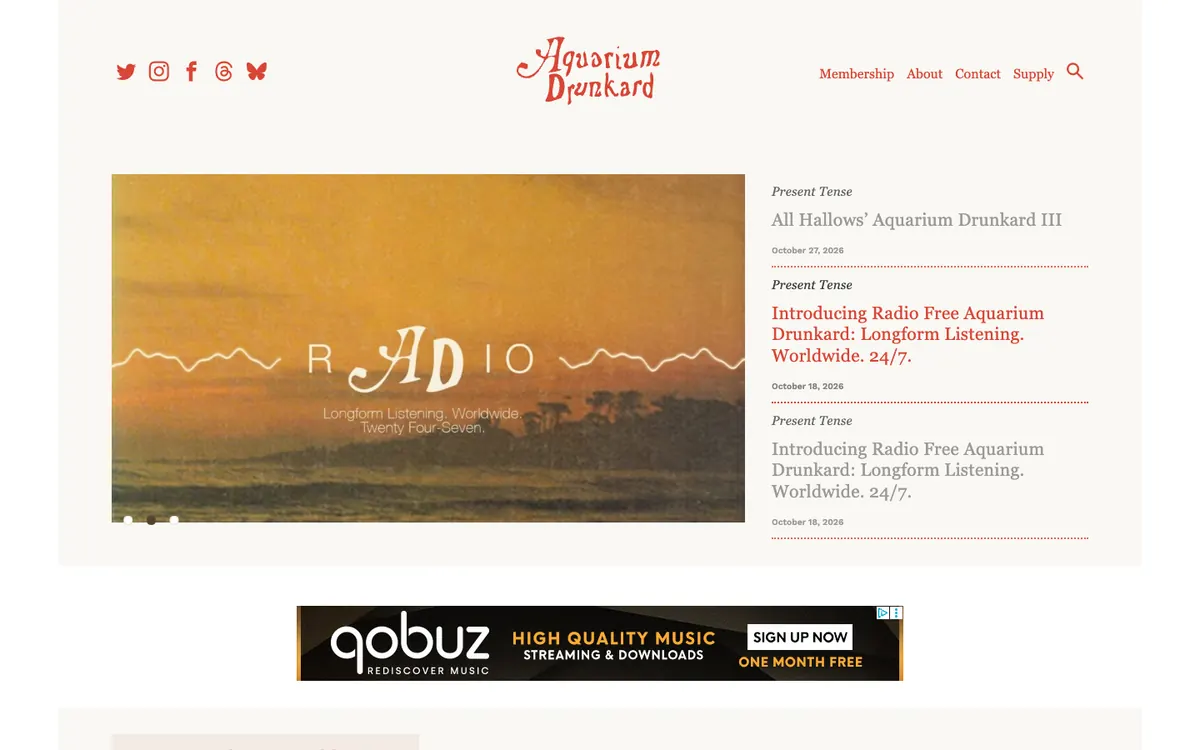
  • Aquarium Drunkard homepage: red hand-lettered logo, a radio slideshow banner and a dated list of stories beside it

    Aquarium Drunkard

    aquariumdrunkard.com · WordPress

    A Los Angeles music journal with features and its own online radio.

    What makes it work

    • A slideshow banner with an orange “RADIO” graphic and three dots leads the page, and the list beside it shows a “Present Tense” label, a headline and a date for each story.
    • The logo is red hand-drawn lettering centered above the page, and the same red is used for menu links and the highlighted headline, which keeps the page to one color accent.
    • The menu is short, with “Membership”, “About”, “Contact” and “Supply” plus social icons on the left and a search icon, so the stories stay the focus.
    Visit Aquarium Drunkard(opens in a new tab)
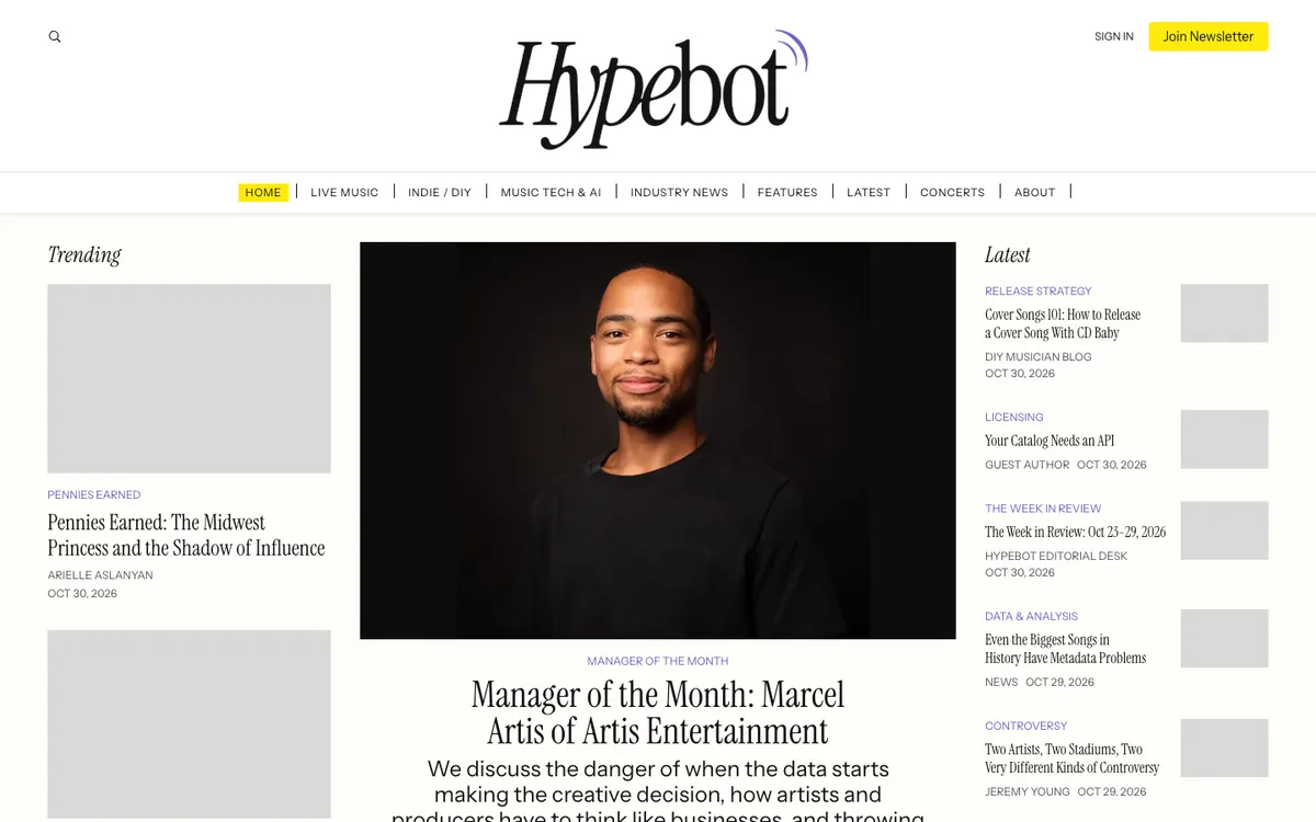
  • Hypebot homepage: serif logo, topic menu, a Manager of the Month portrait feature and a Latest list on the right

    Hypebot

    hypebot.com · Ghost

    Music business news, analysis and how-to guides for artists and managers.

    What makes it work

    • Three columns split the page: “Trending” on the left, one large featured interview with a portrait in the middle, and a “Latest” list on the right with topic labels, authors and dates.
    • The menu runs along a thin ruled bar (“LIVE MUSIC”, “INDIE / DIY”, “MUSIC TECH & AI”, “INDUSTRY NEWS”) and the current page, “HOME”, is highlighted in yellow.
    • A bright yellow “Join Newsletter” button next to “SIGN IN” is the one strong color in the header, so the signup is easy to spot.
    Visit Hypebot(opens in a new tab)
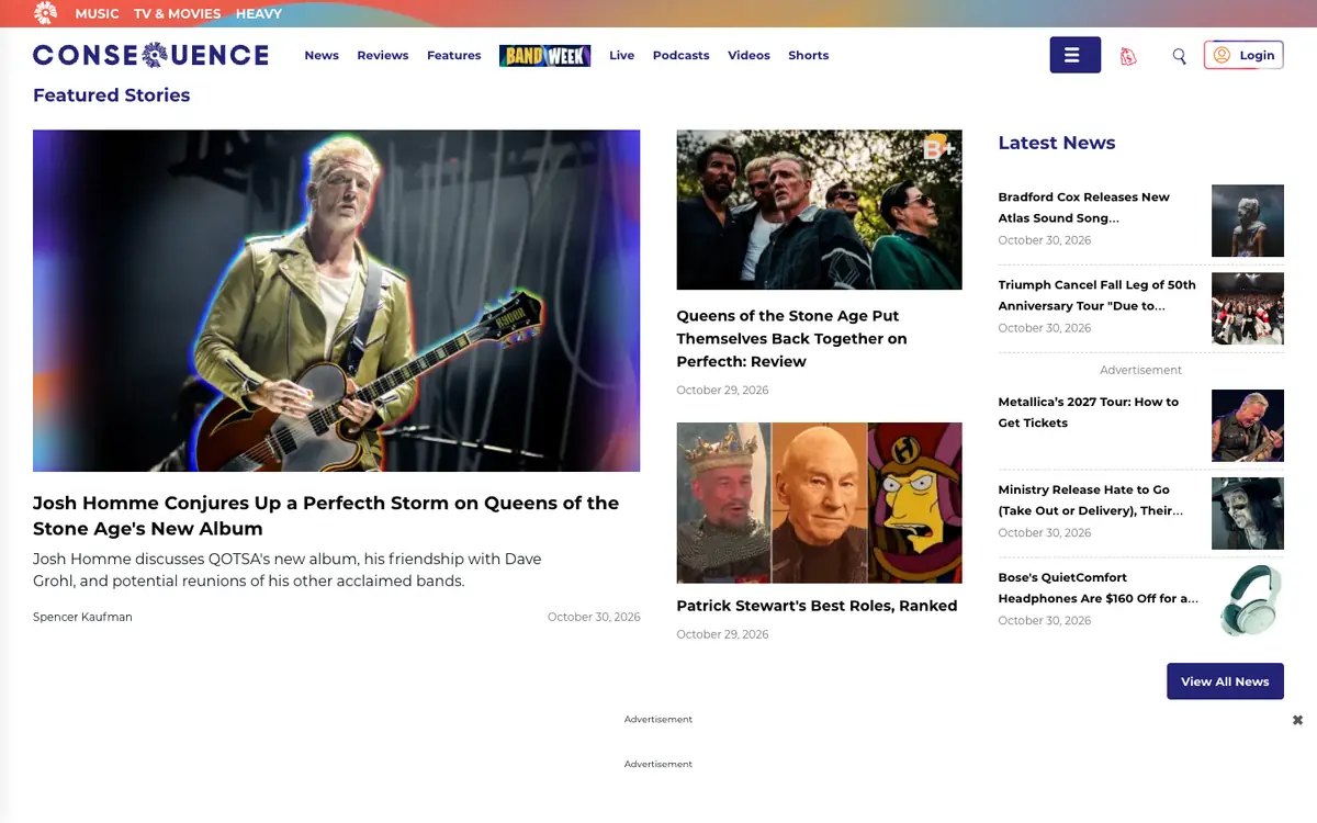
  • Consequence homepage: two-level menu, a large Queens of the Stone Age interview, two story cards and a Latest News list

    Consequence

    consequence.net · WordPress

    Music, TV and movie news with reviews, features and ranked lists.

    What makes it work

    • A top strip splits the site into “MUSIC”, “TV & MOVIES” and “HEAVY”, with a second menu below it for “News”, “Reviews”, “Features”, “Live”, “Podcasts”, “Videos” and “Shorts”.
    • A “Featured Stories” block gives the lead interview the most room on the left and stacks two story cards beside it, each with a headline and a date.
    • The “Latest News” column on the right lists short headlines with small square photos and dates, and ends with a “View All News” button.
    Visit Consequence(opens in a new tab)
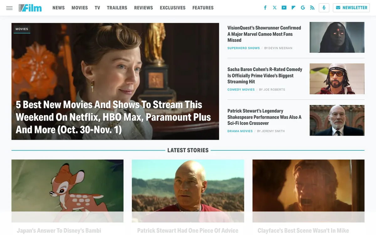
  • /Film homepage: top menu, a large streaming-picks lead photo, three side headlines and a Latest Stories row

    /Film

    slashfilm.com · WordPress

    Movie and TV news, trailers, reviews and interviews.

    What makes it work

    • The lead story, “5 Best New Movies And Shows To Stream This Weekend On Netflix, HBO Max, Paramount Plus And More”, fills a big photo block with three smaller headlines beside it, so the top story and the next few are visible at once.
    • A slim top menu lists “NEWS”, “MOVIES”, “TV”, “TRAILERS”, “REVIEWS”, “EXCLUSIVES” and “FEATURES”, with a “NEWSLETTER” button on the right, so readers can jump straight to the kind of coverage they want.
    • Each side headline carries a blue category tag and a byline, such as “SUPERHERO SHOWS / BY DEVIN MEENAN”, and a “LATEST STORIES” row of image cards starts below the lead.
    Visit /Film(opens in a new tab)
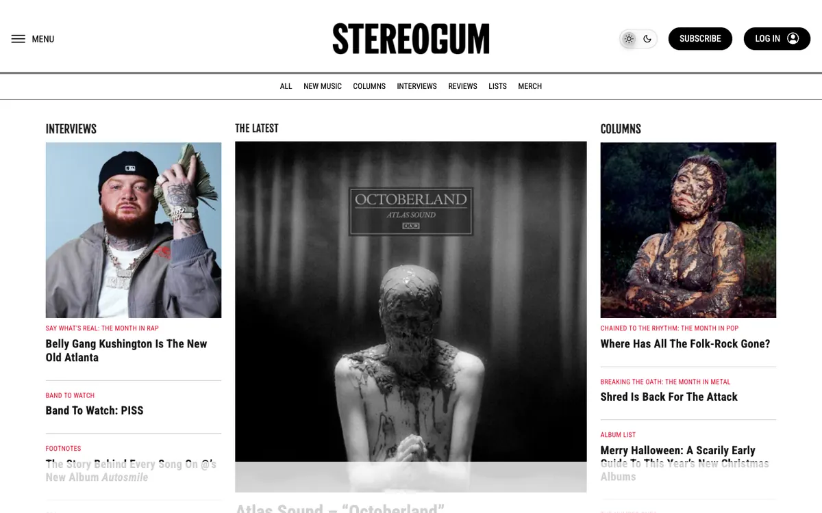
  • Stereogum homepage: centered logo, a section menu and three photo columns for Interviews, The Latest and Columns

    Stereogum

    stereogum.com · WordPress

    Music news, interviews, reviews and genre columns for rap, pop and metal.

    What makes it work

    • The homepage splits into three columns, “INTERVIEWS”, “THE LATEST” and “COLUMNS”, each led by a large photo, so readers can choose a format before choosing a story.
    • Red kickers above the headlines, such as “BAND TO WATCH”, “THE MONTH IN POP” and “BREAKING THE OATH: THE MONTH IN METAL”, tell readers what kind of piece each one is.
    • A centered black logo sits between “MENU” on the left and “SUBSCRIBE” and “LOG IN” buttons on the right, with a light and dark theme switch beside them and a thin row of section links below.
    Visit Stereogum(opens in a new tab)
No blog yet? Get one free with Outrank BlogsFree
A fast, SEO-ready blog on your own domain, live in one minute. Outrank publishes your articles to it automatically.
Create your blog for free

More blog examples by niche

See all blog examples
background

Your turn

Found a style you like? Start a blog like this, free.